Coura Sem Paredes
Place-brand concept turning a town's own name into an operating principle: if Paredes means walls, the future is dropping them.
"If the town is called 'Walls of Coura,' the most powerful thing it can do is drop them. Paredes became the enemy: outdated paradigms, limiting stereotypes."

"Place brands aren't invented from the outside. They're revealed by finding the tension in a place's own name and giving it permission to say it out loud."


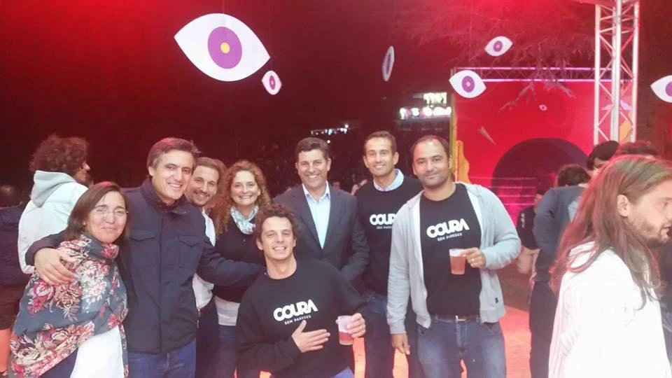
#CouraSemParedes transformed a small Portuguese municipality known only for its music festival into a coherent place brand built on the idea of dropping walls. Literally turning the town's name against itself. The concept unified innovation, education, industry, and culture under one operating principle.
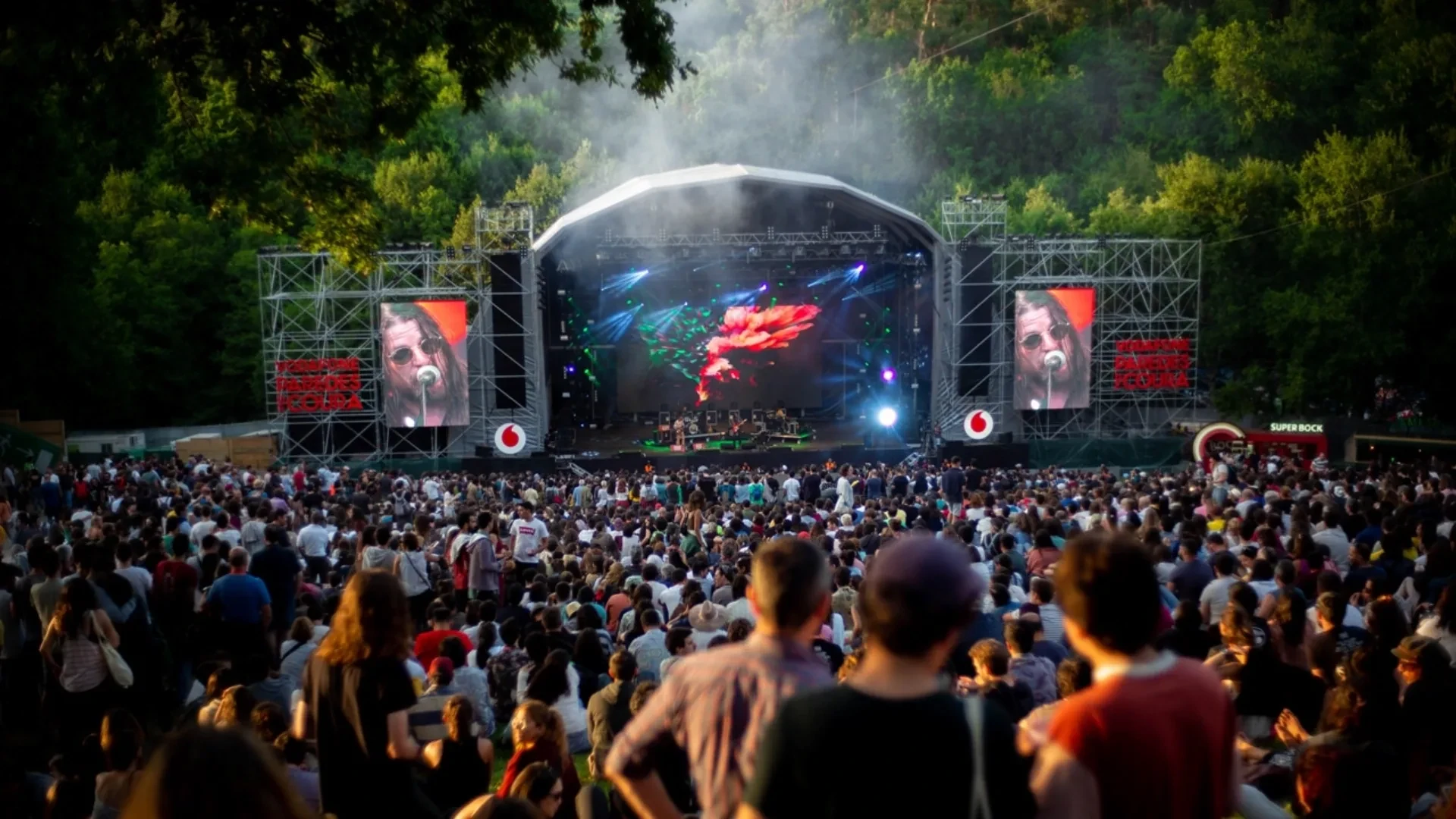
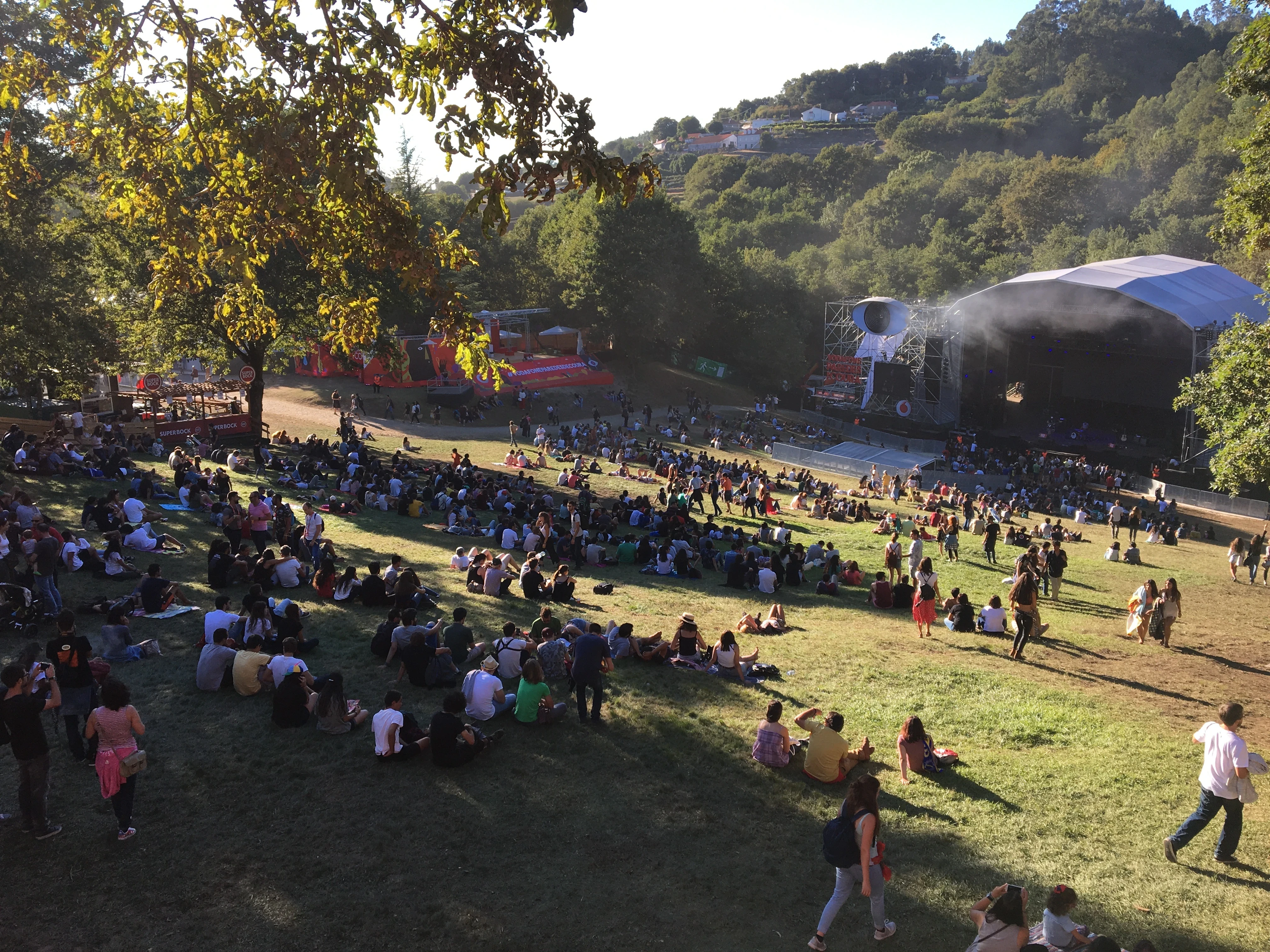
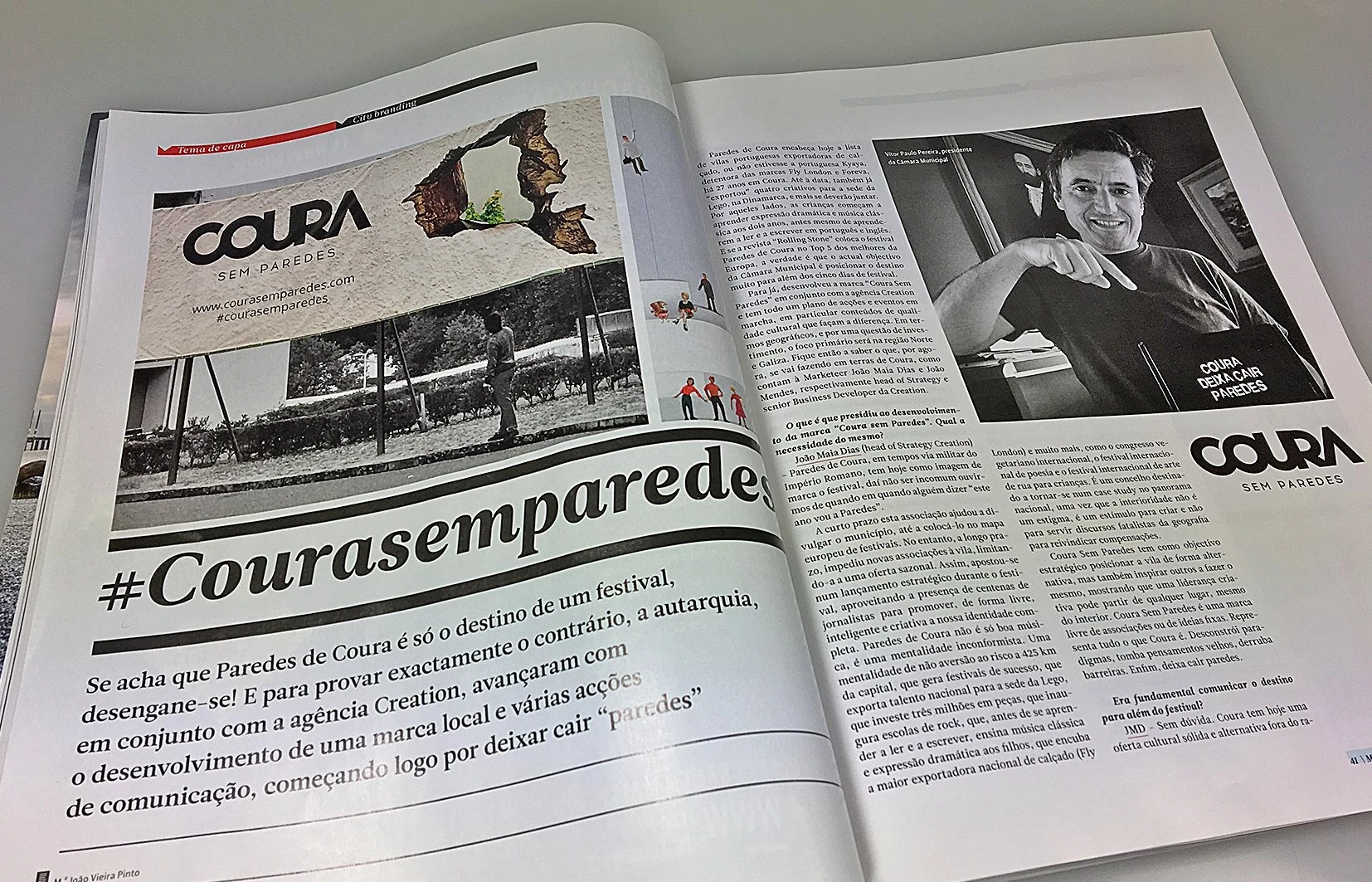
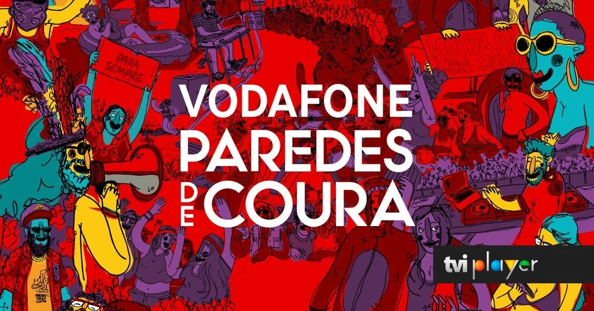
"Paredes de Coura" literally translates to "Walls of Coura." For most people, the name maps to one thing: the Vodafone Paredes de Coura music festival (Portugal's longest-running festival, consistently ranked among Europe's best by Rolling Stone, and a genuine cultural landmark).
The municipality wanted to use that spotlight to reveal what lies behind the name: a small territory in northern Portugal with an outsized concentration of innovation, creative talent, export-driven industry, pioneering education, and a rare appetite for risk. The brief was to give Coura a voice beyond the festival and a platform that could travel.
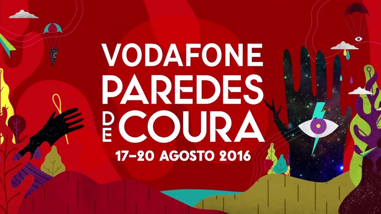
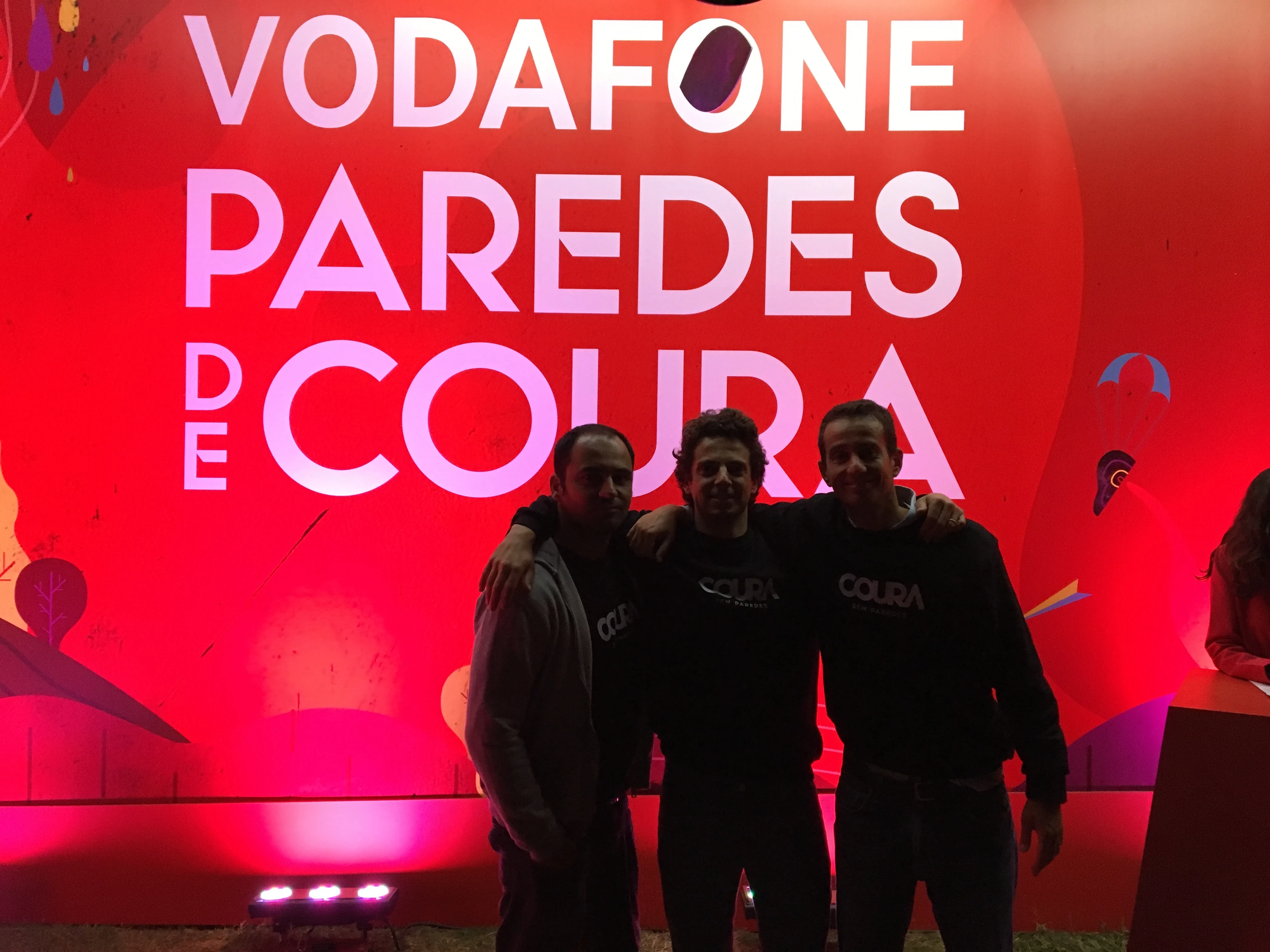
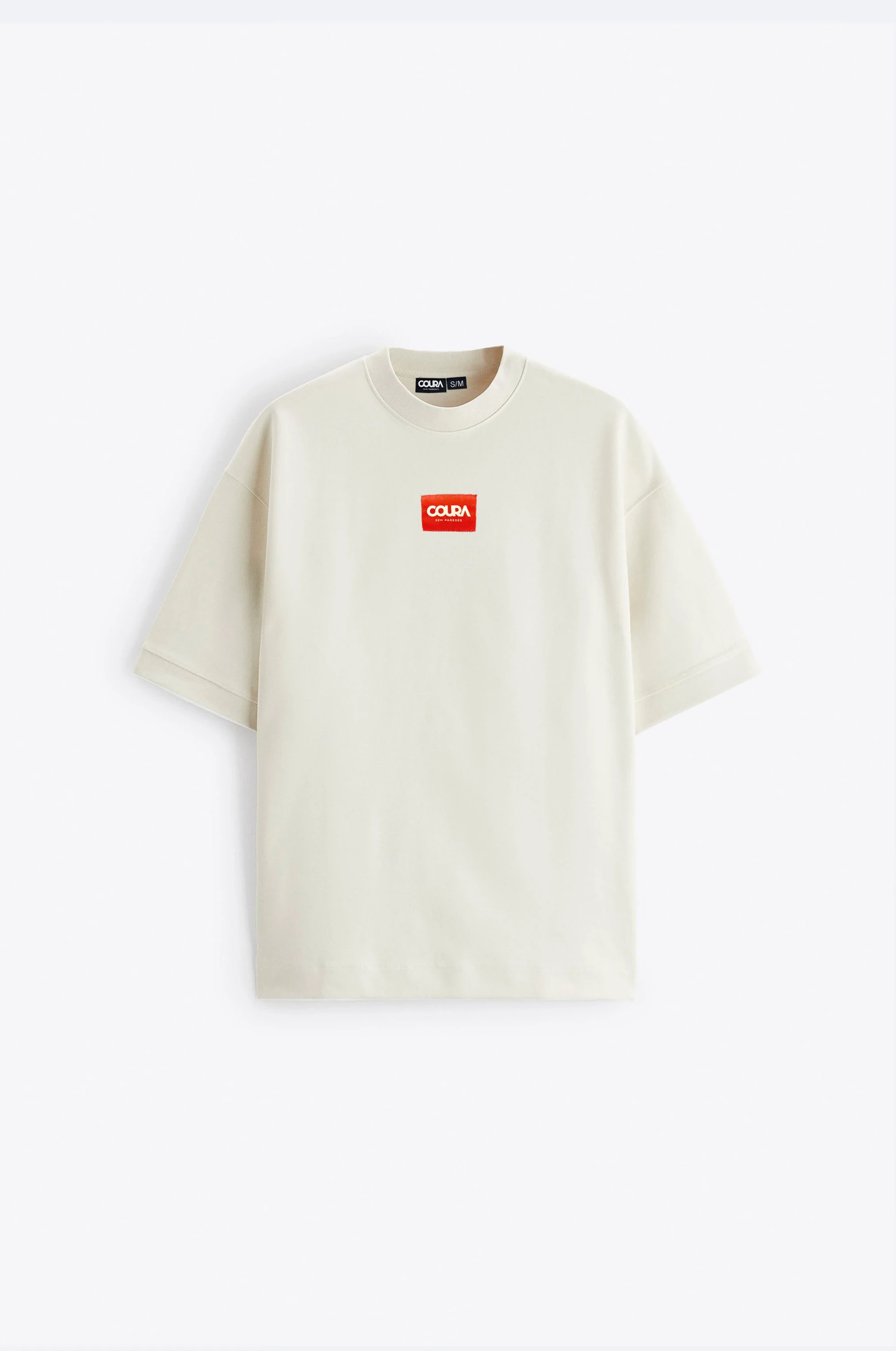
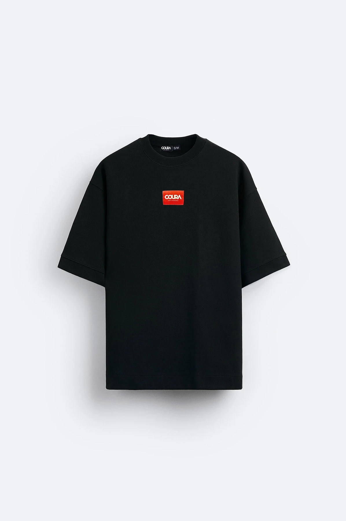
#CouraSemParedes ("Coura Without Walls") was developed as a strategic concept that turns the town's own name into the idea: if Paredes means walls, then the future is dropping them. Not a campaign. Not a tagline. A place-brand operating principle: part cultural brand, part regional identity, part movement.
The work was featured in Marketeer magazine and helped spark a broader national conversation around place brands, region brands, and country-brand thinking in Portugal.
A single-story problem. Paredes de Coura was internationally recognised, but only for its festival. Everything else about the municipality was invisible: its industries, its people, its education model, its creative exports. A place with an extraordinary story was being reduced to one week in August.
A perception gap. Portugal's interior is routinely associated with decline, depopulation, and slow economies. Coura contradicted every one of those assumptions, but had no platform to prove it. The facts existed. The narrative didn't.
A name that could work against itself. "Paredes" means walls. In a project about openness, ambition, and dropping barriers, the town's own name contained the tension and the opportunity.
The core move: turn the name into the strategy. If the town is called "Walls of Coura," the most powerful thing it can do is drop them. Paredes (walls) became the enemy: not physical walls, but mental ones. Outdated paradigms, limiting stereotypes, the reduction of a place to a seasonal headline. The concept wrote itself from the tension embedded in the name.
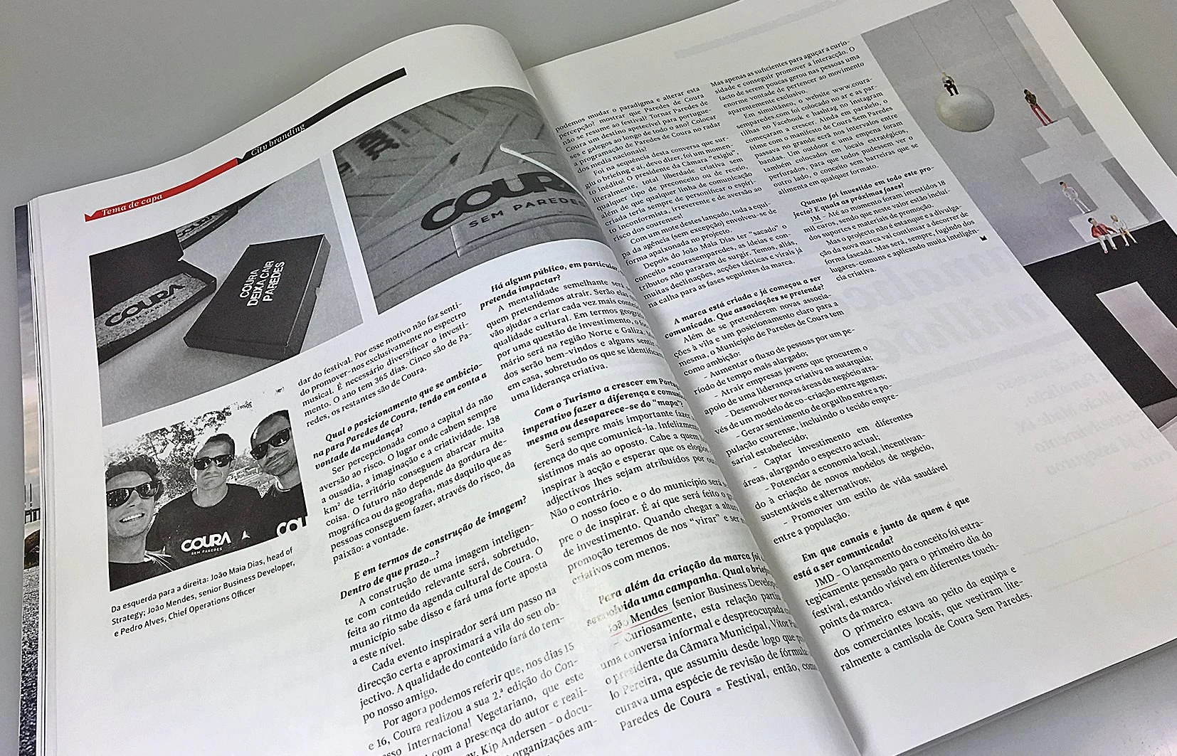
The platform logic: open by design. #CouraSemParedes was deliberately built to resist fixed categorisation. It could function as a cultural brand, a tourism initiative, a civic movement, an investment narrative, or a community rallying cry, depending on the context. That flexibility wasn't vagueness. It was the strategy: a living brand that could grow with Coura instead of boxing it in.
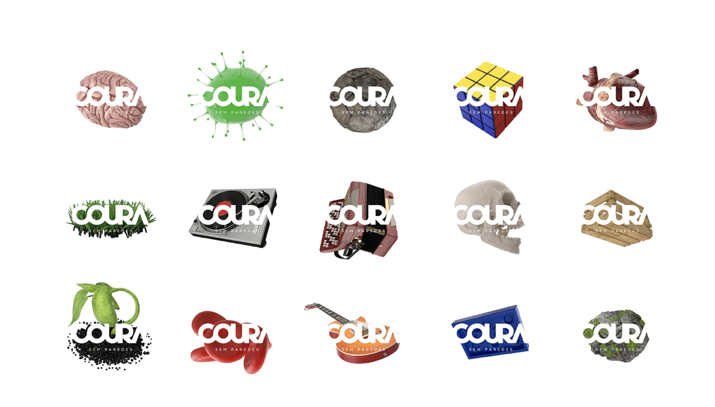
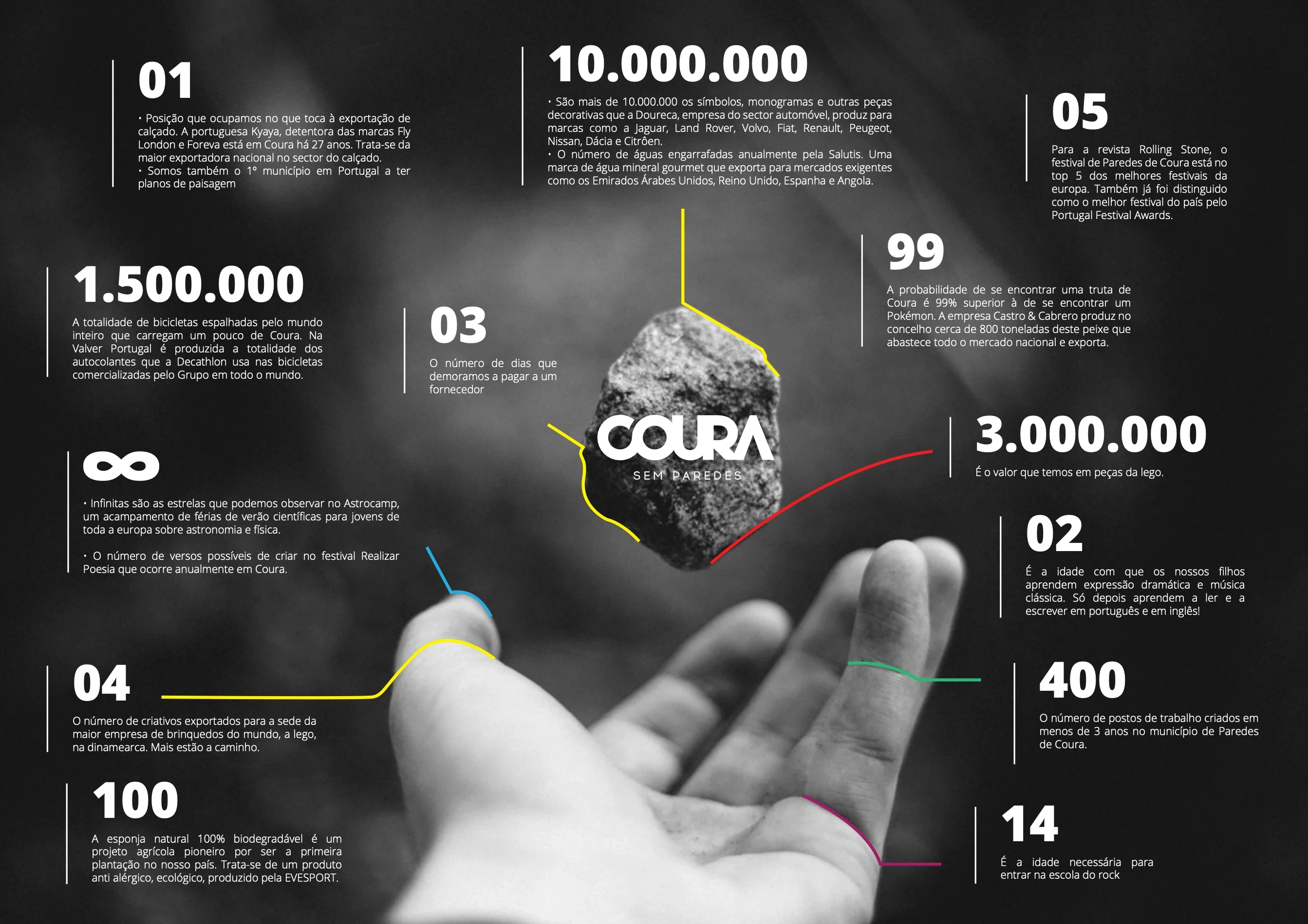
The proof engine: facts, not poetry. Place brands often collapse into beautiful words with no substance behind them. To avoid that trap, the concept was anchored in a curated system of concrete, surprising proof-points. Local facts were structured as signals of a much larger story:
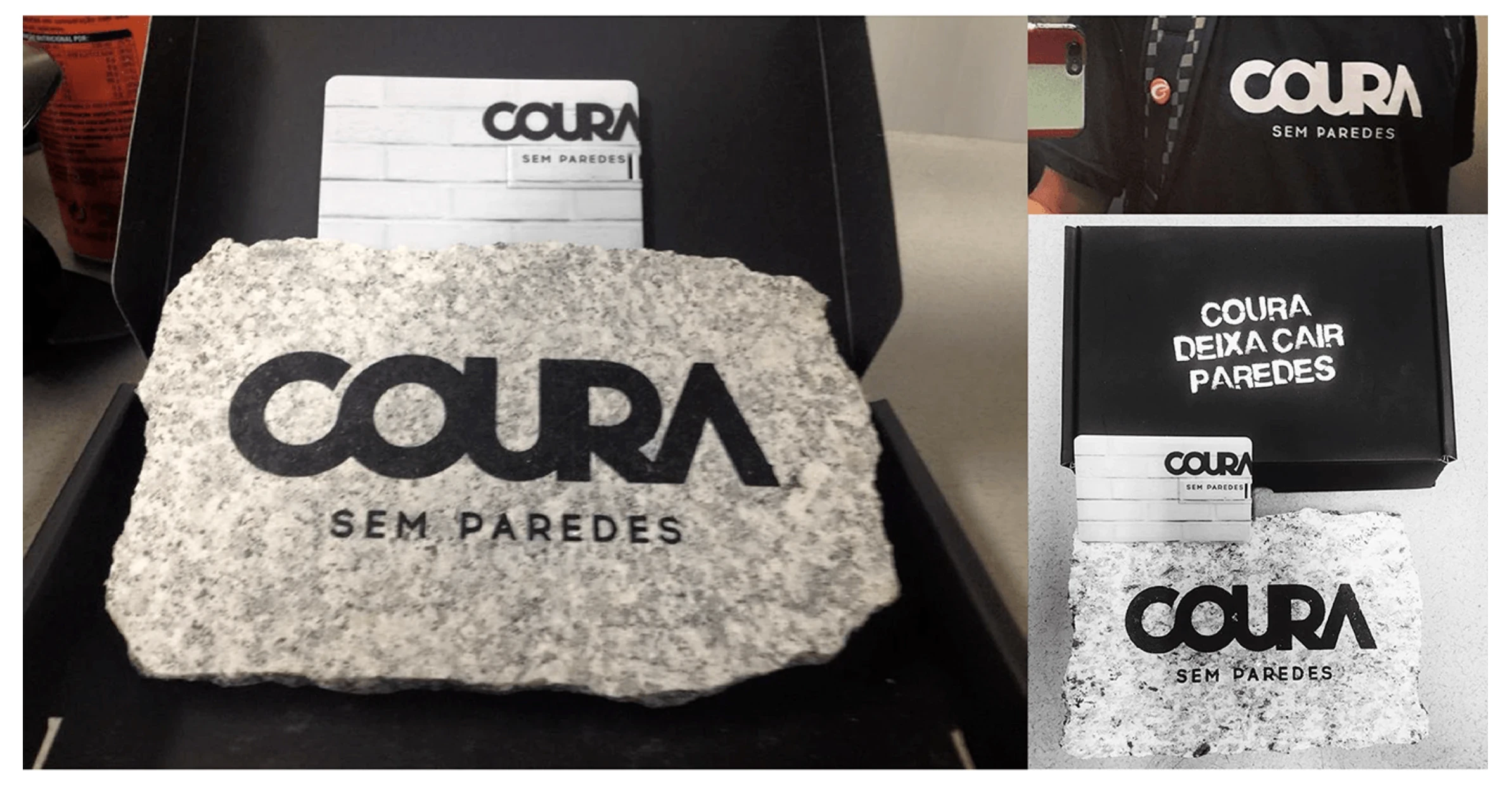
- Portugal's #1 footwear exporter (Kyaia/Fly London) has been based in Coura for 27+ years.
- Four creatives from Coura work at LEGO's headquarters in Denmark. More are on the way.
- 1.5 million bicycles worldwide carry Coura-made decals (Valver Portugal produces all of Decathlon's global bike stickers).
- 10+ million symbols, monograms, and decorative parts are produced locally by Doureca for Jaguar, Land Rover, Volvo, Fiat, Renault, Peugeot, Nissan, Dacia, and Citroën.
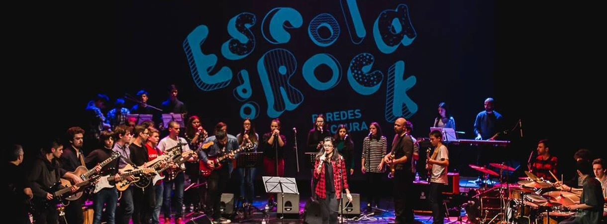
- Children in Coura learn dramatic expression and classical music at age 2, before they learn to read and write.
- The municipality was the first in Portugal to have landscape plans.
- Coura pioneered Portugal's first 100% biodegradable natural sponge plantation (Evesport).
- The municipality pays suppliers within 3 days.
- 400 new jobs created in under 3 years.
These weren't a bullet list in a brochure. They were structured as a narrative engine. Each fact reframed what "small" and "interior" really mean.
The press reframe: disarm, then redirect. The launch narrative was designed to neutralise the obvious assumption in its opening line: "Not the festival, that stays." Then it pivots hard: Coura isn't a seasonal headline or a remote dot on the map. It's a capital of audacity, imagination, and creativity, inviting people to associate with an "improbable cause." The structure was deliberate: disarm → reframe → invite.
Written as a cultural artifact that locals could own and outsiders could remember. It frames Coura as psychologically borderless: the sky is the same everywhere; the limits are ours. Originally written in Portuguese:
Ninguém diria mas este céu é igual ao de Berlim.
A terra que pisam, a que me toca a mim, sim. É diferente. Serena.
É distante no ar, do mar, do manto azul.
Mas quem diria. A cor do céu aqui também é azul.
Não tenho mar, não tenho sal, não tenho medo de ter medo.
Só quero ser a melhor versão de mim cedo.
O sol nasce, constroem-me LEGOs, acalmam-se os egos,
outros de mente cegos erguem-me barreiras,
ideias sem maneiras
até ao dia em que percebem que no céu não há fronteiras.
Não em mim, não em Berlim.
Sou agreste, campestre, mestre do leste.
Mexe comigo quem diminui o interior.
O céu continua azul, num rio a norte numa terra a sul.
Acordes acordam com alma a calma de setembro.
Estremecem e aquecem a terra até dezembro.
Sempre fui futuro. Quando começou? Não me lembro!
Está em constante movimento. E tu estás dentro.
Livre. Livre de livros fechados em copas.
Um copo a ti e aos que tocas.
Coura. Sem paredes.
Concept Platform: #CouraSemParedes. A hashtag that works as a distribution mechanic: short enough to spread, meaningful enough to own, and conceptually elastic enough to live across topics (culture, education, business, nature, innovation) without losing integrity. The platform functioned simultaneously as a brand name, a social identity, and a civic rallying cry.
Messaging Architecture. A complete narrative system built to serve multiple audiences and contexts: press, institutional communication, investment positioning, tourism, and community engagement. All were connected to the same core idea but adaptable in tone and depth.
Proof-Point Storytelling Framework. The curated facts weren't just data. They were structured into a modular storytelling system. Each proof-point was designed to surprise, reframe, and collectively build the argument that Coura is one of Portugal's most quietly remarkable places. The framework was built to fuel ongoing content, press pitches, and campaign material over time.
Press Release & Launch Narrative. The launch press piece was crafted as strategic communication, designed to shift editorial framing from "festival news" to "place brand story." The opening line set the tone: this isn't about the festival, it's about what Coura really is when the stages come down.
#CouraSemParedes gave Paredes de Coura something it had never had: a voice beyond the festival. A single concept that could hold tourism, culture, innovation, civic pride, and investment narrative under one roof without reducing the place to any one of them.
The project was featured in Marketeer magazine and contributed to a broader national conversation about the role of place brands, region brands, and country-brand thinking in Portugal. This positioned Coura not just as a case study, but as a provocation: if a municipality of 9,198 people can build a brand this coherent, what's stopping everyone else?
The concept proved that the most powerful place brands aren't invented from the outside. They're revealed by listening to what a place already is, finding the tension in its own name, and giving it permission to say it out loud.