The Next Gen Station
One of Europe's most advanced hydrogen refuelling stations became a brand with its own identity, film, and digital launch system reaching decision-makers globally.
"If a child can explain how refuelling works, the technology is truly intuitive. This wasn't a tonal choice; it was the strategic mechanism."
"The project needed its own identity. Not Petrotec's. Not Toyota's. A distinct brand world that could represent shared ambition without forcing any single partner to own the narrative."
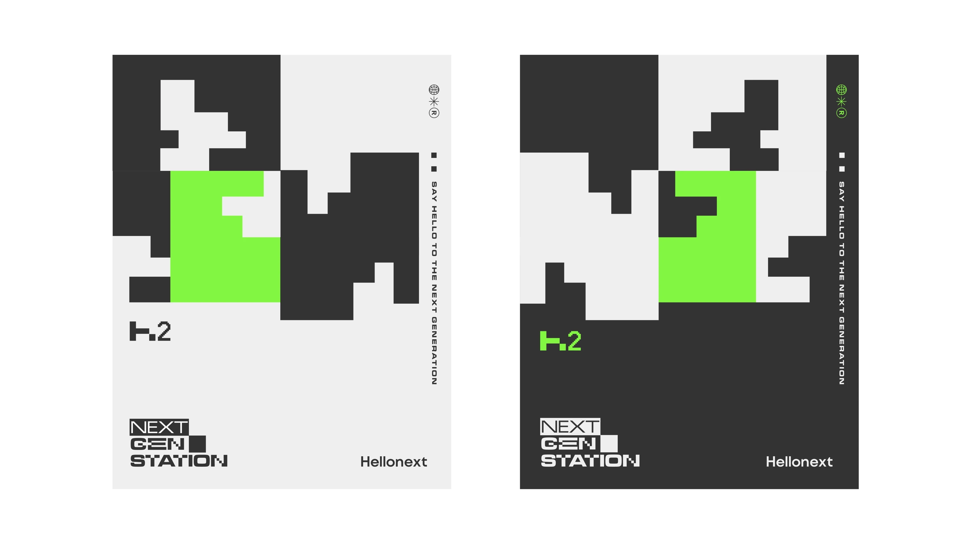
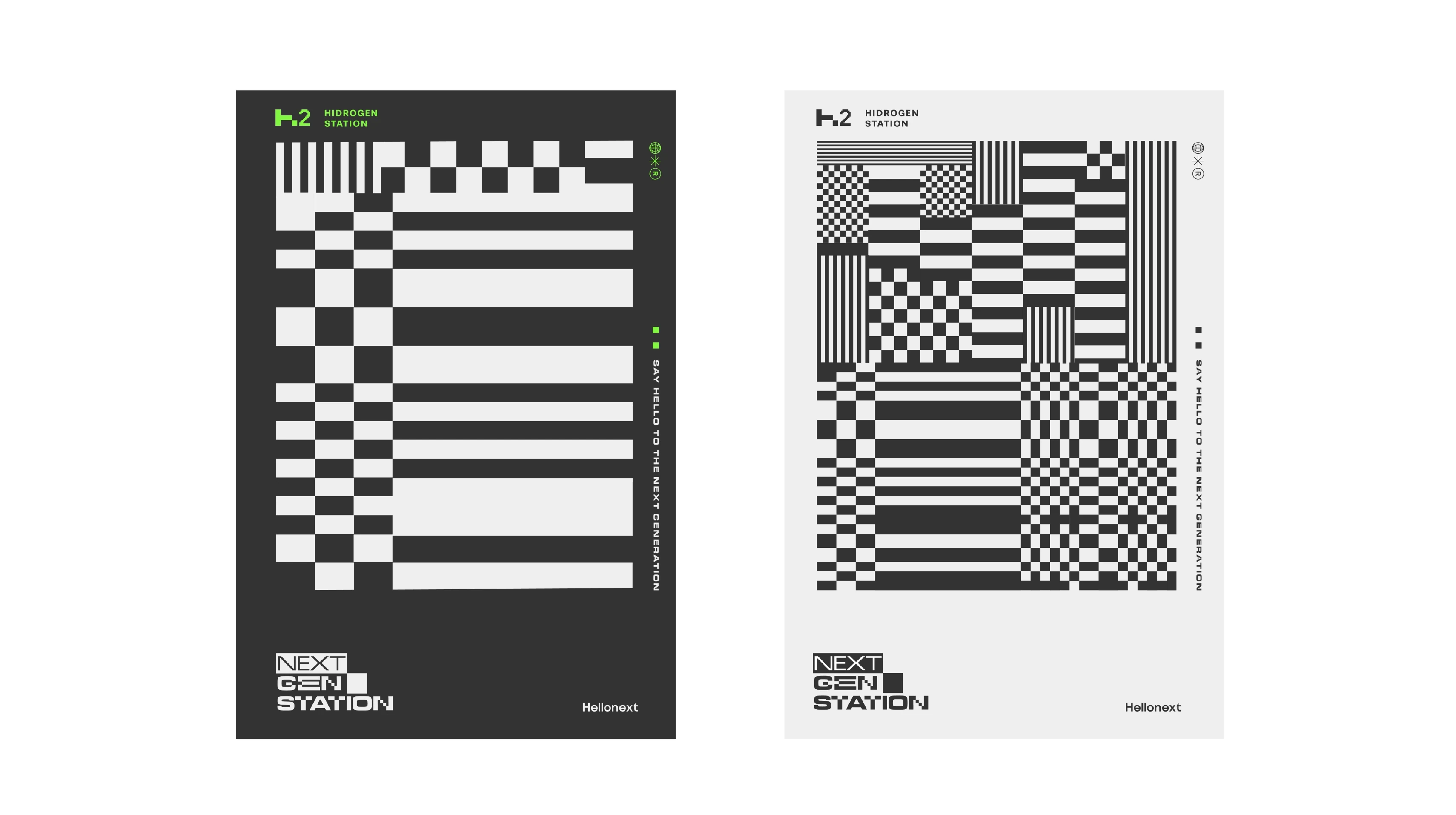
"The visual system draws from automotive prototype culture: camouflage wraps used on pre-release vehicles. Advanced, not yet fully revealed, ahead of its time."
"The narration is deliberately unpolished, full of a child's logic: hydrogen is 'magic gas (the clean kind),' the station has 'a huge brain that checks everything,' and refuelling is 'like a game.'"
"A multi-partner infrastructure investment became a single, ownable brand experience with its own name, visual language, and strategic voice."
Europe's most advanced hydrogen station transformed into a standalone brand with visual identity, hero film, and digital launch system designed to reach decision-makers globally and make hydrogen infrastructure feel intuitive rather than complex.
One of Europe's most advanced hydrogen refuelling stations needed to become more than infrastructure. It needed to become a brand; one that could hold four partners, speak to governments and industry, and make hydrogen feel like something anyone could use.
I originated the concept and led creative direction end-to-end: from strategic positioning and naming to the hero film, visual identity, and a digital launch system built to perform at World Hydrogen Summit 2025.
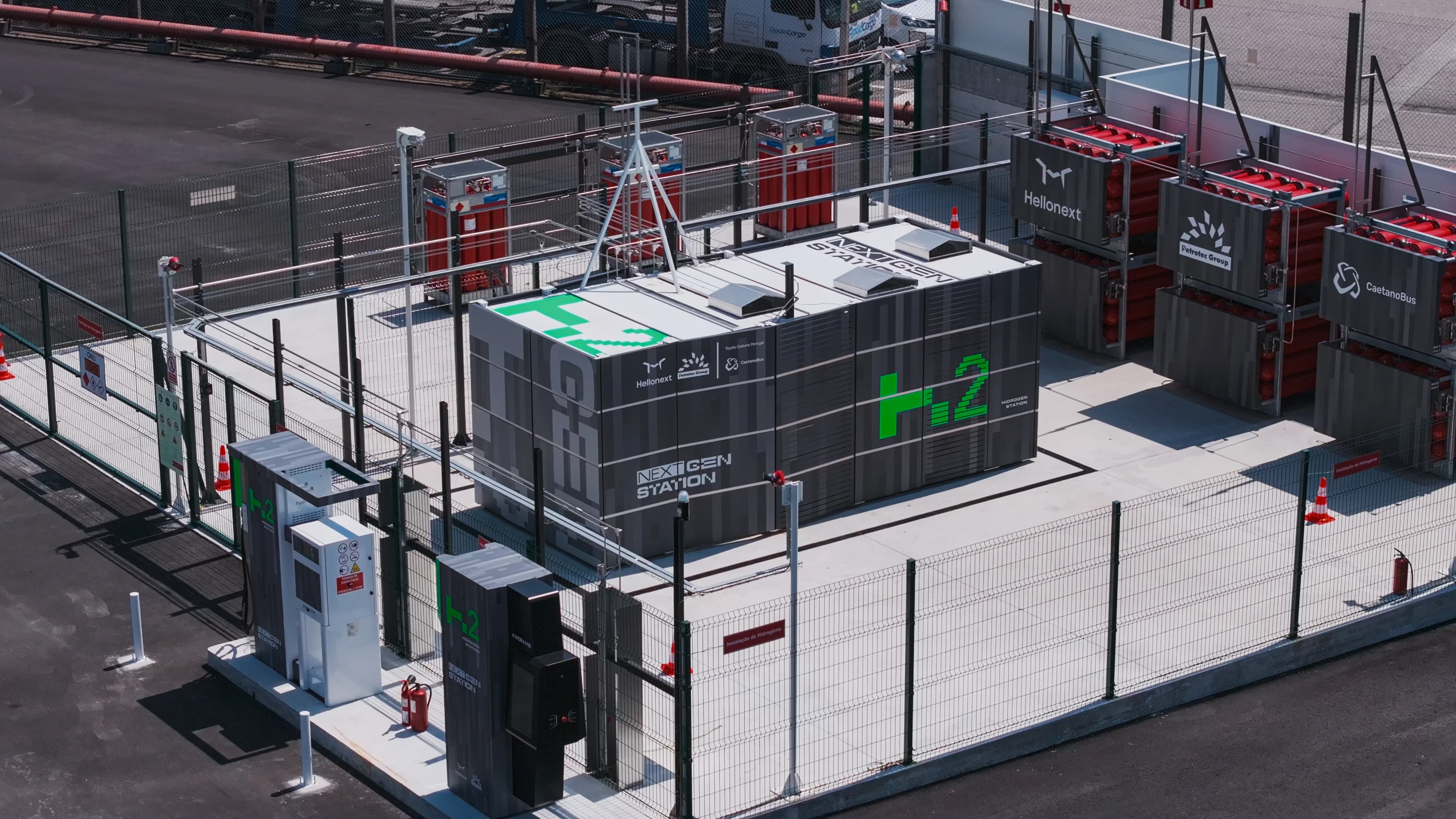
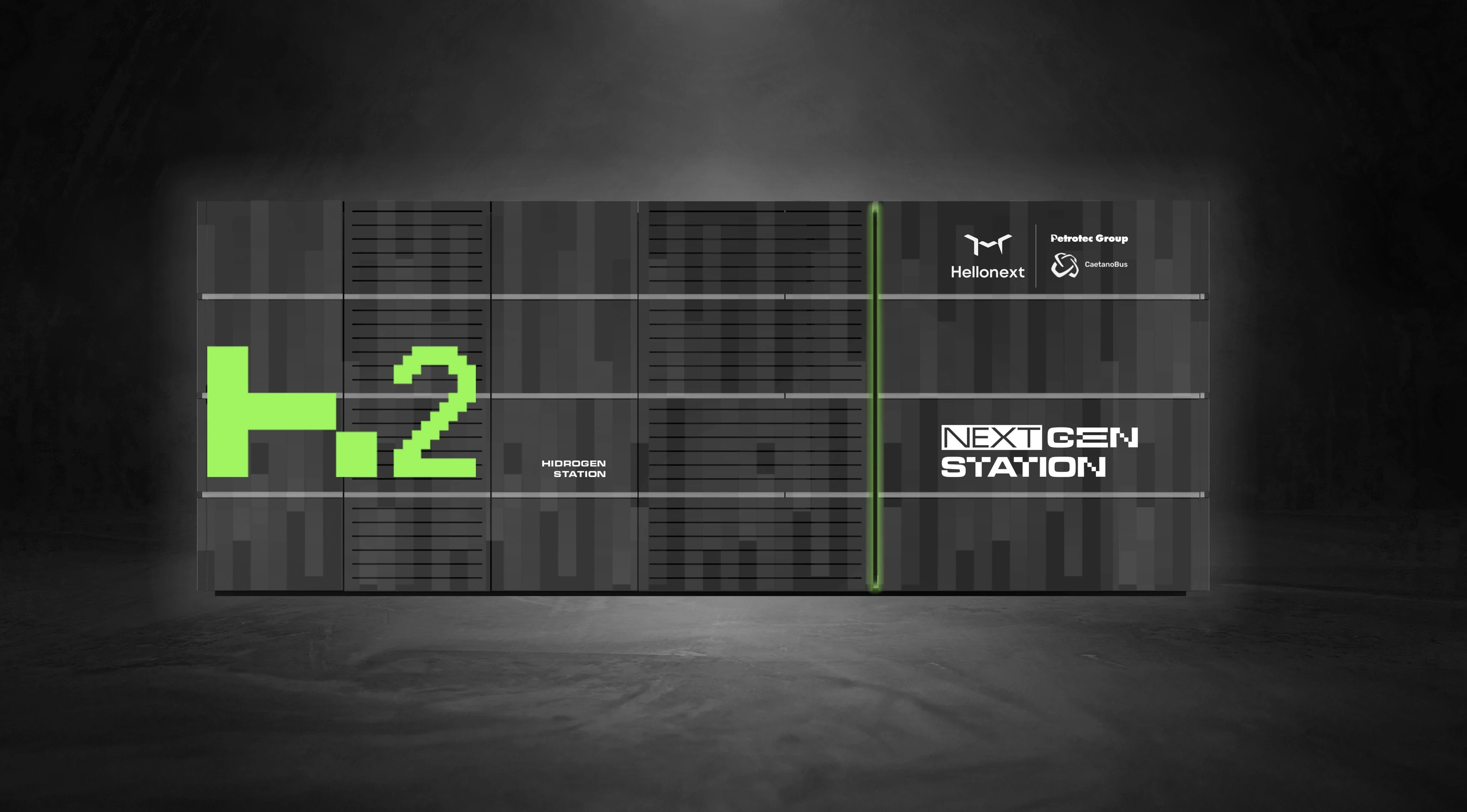
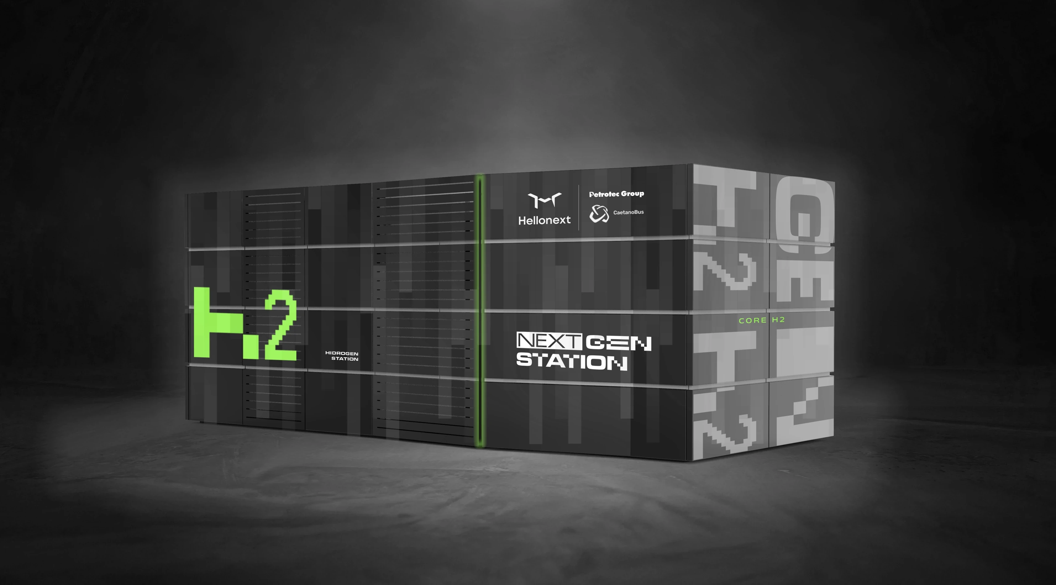
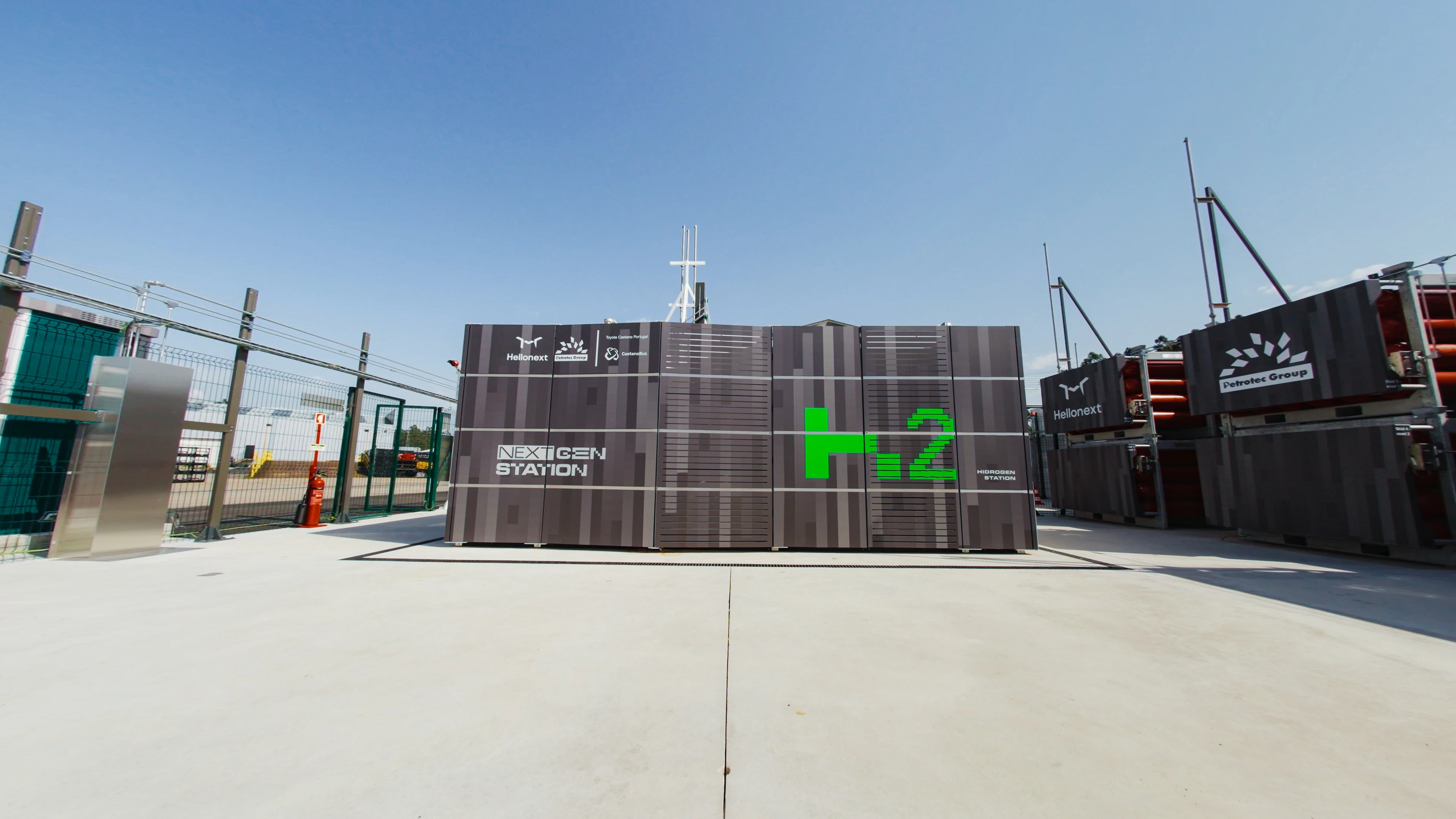
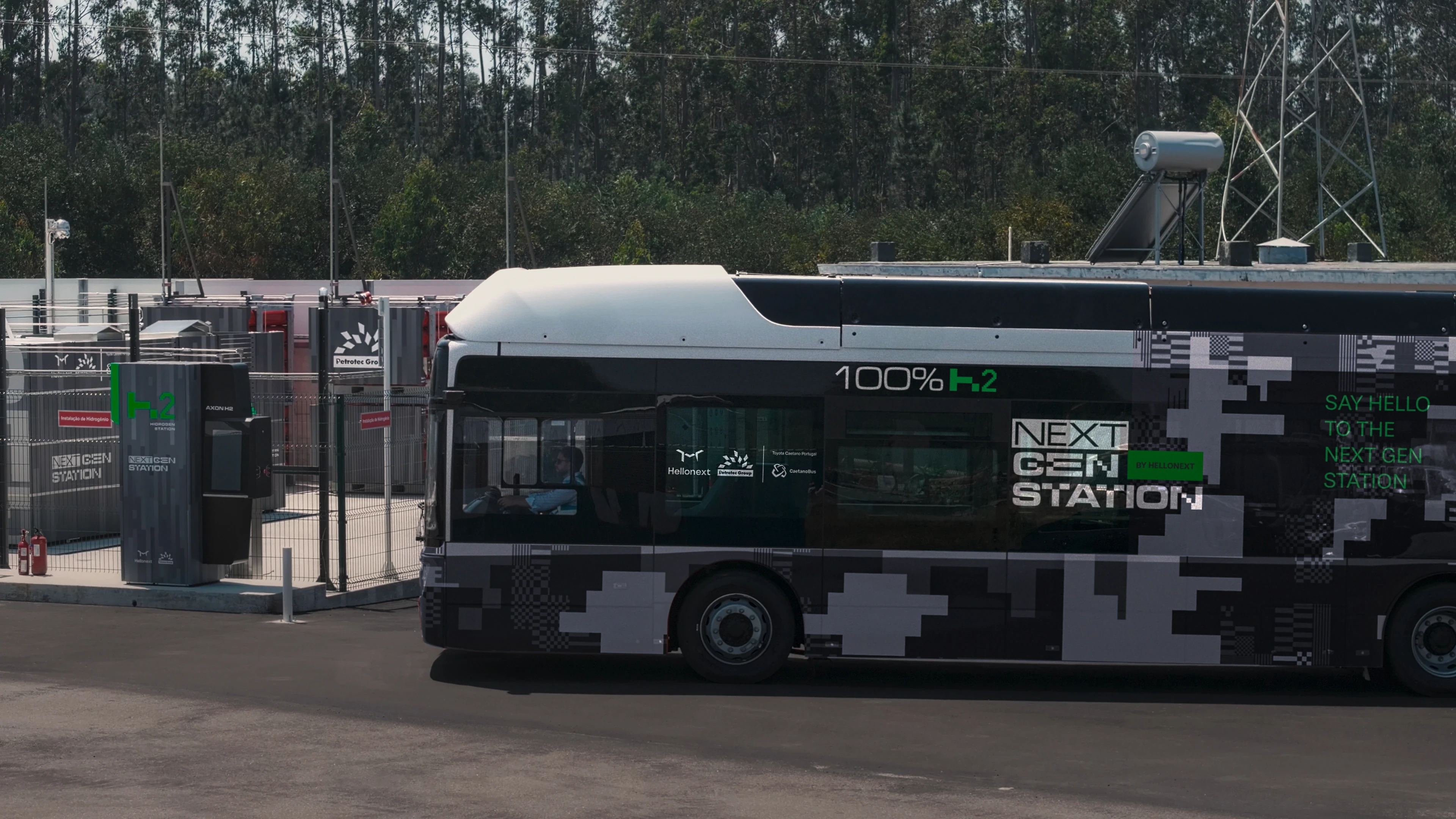
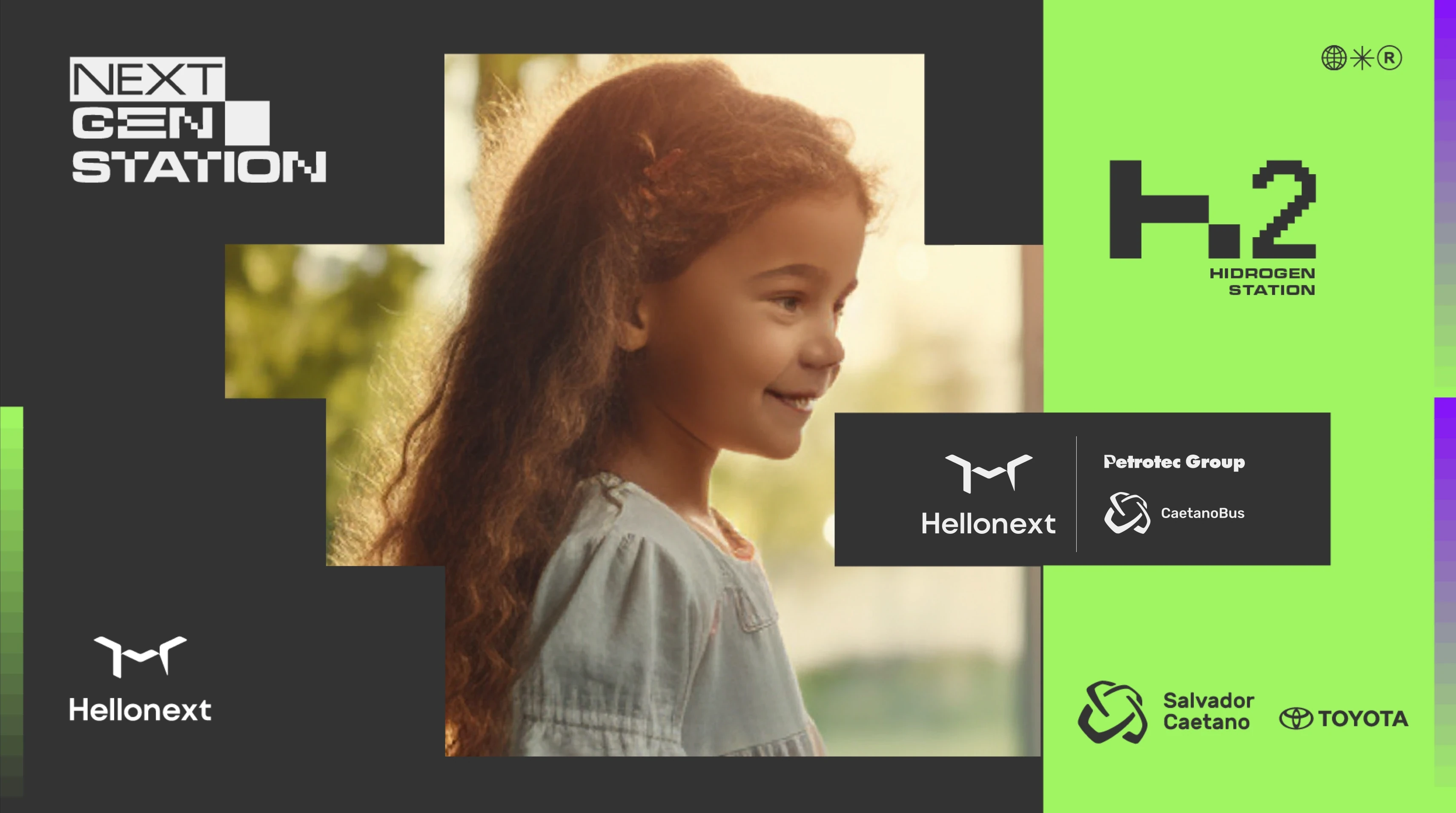
The station (installed at CaetanoBus' industrial unit in Ovar, Portugal) was a joint investment between Petrotec Group (via its hydrogen arm Hellonext), Toyota Caetano Portugal, and CaetanoBus.
Two problems sat at the core of this brief:
A perception problem. Hydrogen is still seen as complex, technical, and unsafe by most audiences outside the industry. Any communication that leaned into specs and jargon would reinforce the barrier, not break it.
A co-branding problem. Four brands funding one project. The typical output: logo soup, diluted messaging, and communication that reads like a press release. None of which builds equity for the project or the partners.
Decision 01: Build a standalone brand, not a co-branded asset. The project needed its own identity. Not Petrotec's. Not Toyota's. A distinct brand world that could represent shared ambition without forcing any single partner to own (or lose) the narrative. This was the first and most defining strategic call.
Decision 02: Launch tactically, not ceremonially. The conventional path was a high-cost institutional inauguration with government officials and media. I argued against it. The real objective wasn't local press; it was reaching the right 5,000 people globally: hydrogen decision-makers, policy shapers, and potential partners. The budget would go further as a precise, digital-first launch system: targeted distribution on LinkedIn, designed to land at World Hydrogen Summit 2025 in Rotterdam and scale from there.
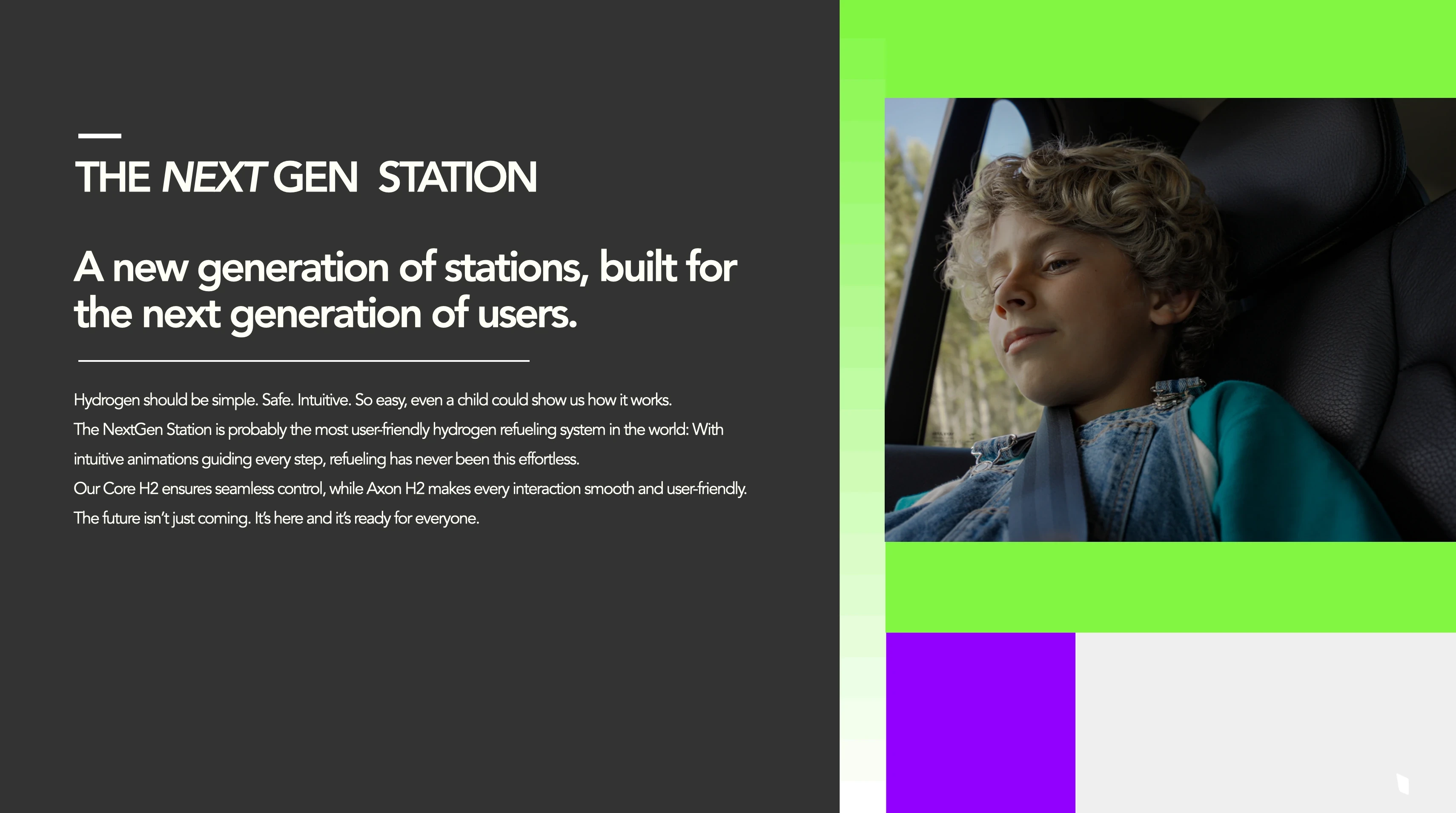
Decision 03: Make hydrogen feel effortless. Use a child to prove it. If a child can explain how refuelling works, the technology is truly intuitive. This wasn't a tonal choice; it was the strategic mechanism:
- Decomplexification. A child translating the refuelling process into plain language proves simplicity better than any spec sheet.
- Safety reframing. A child's presence in the narrative makes the technology feel trustworthy at an emotional level, before the rational argument even starts.
- Future signalling. A child is the next generation. The station is literally built for them. Every partner becomes a future-facing brand by association.
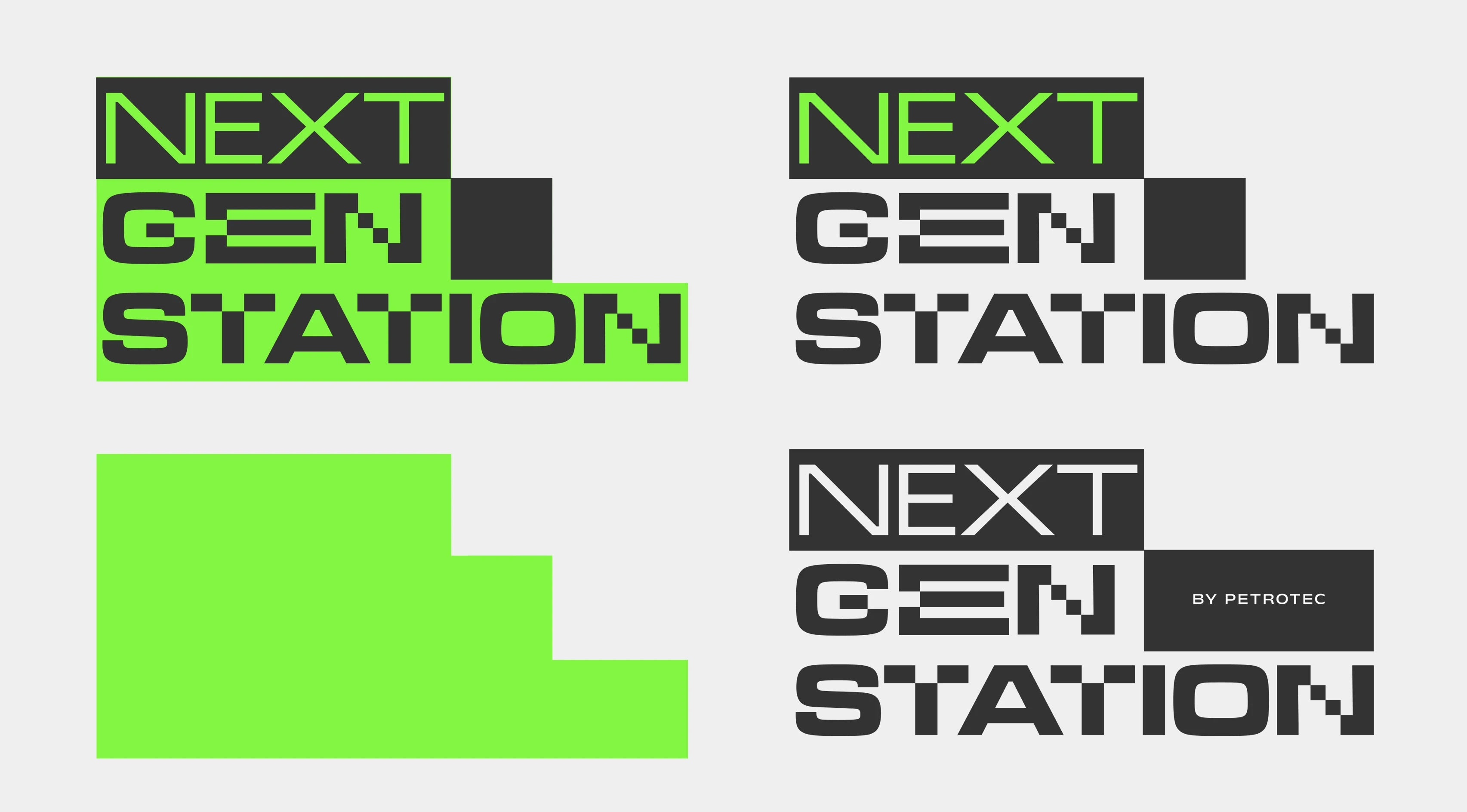
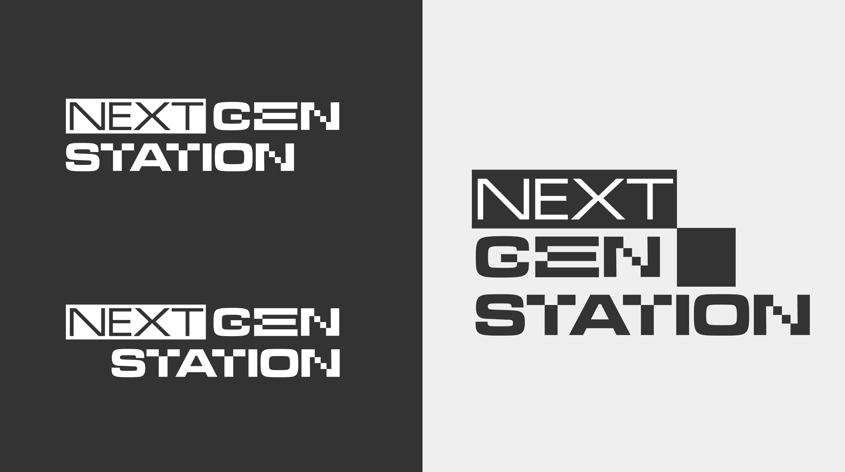
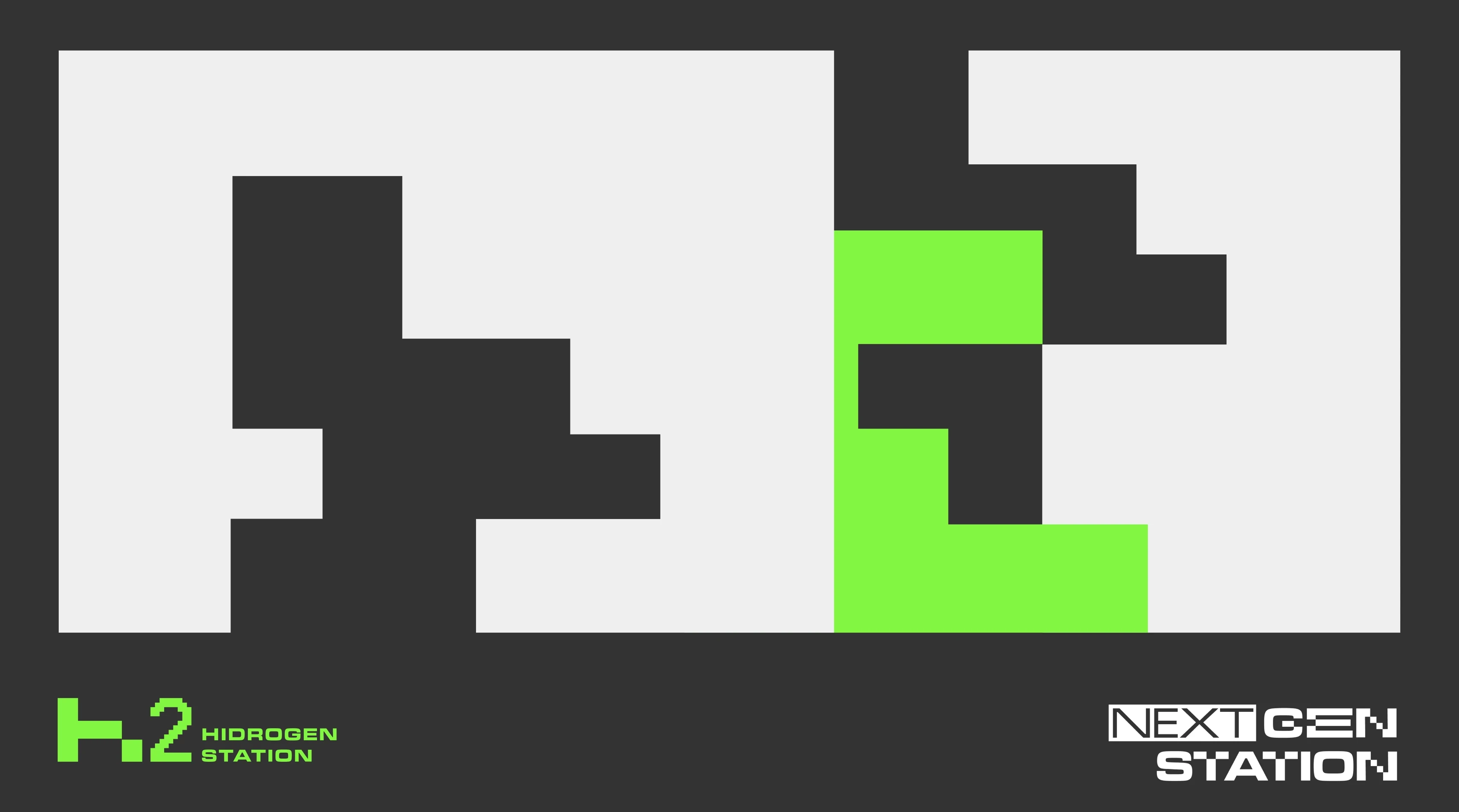
Naming & Positioning. The Next Gen Station / TH2 Next Gen\_ERATION: a name that works on two levels. A new generation of stations built for the next generation of users. The "H2" embedded in "TH2" encodes hydrogen into the brand's DNA without forcing it.
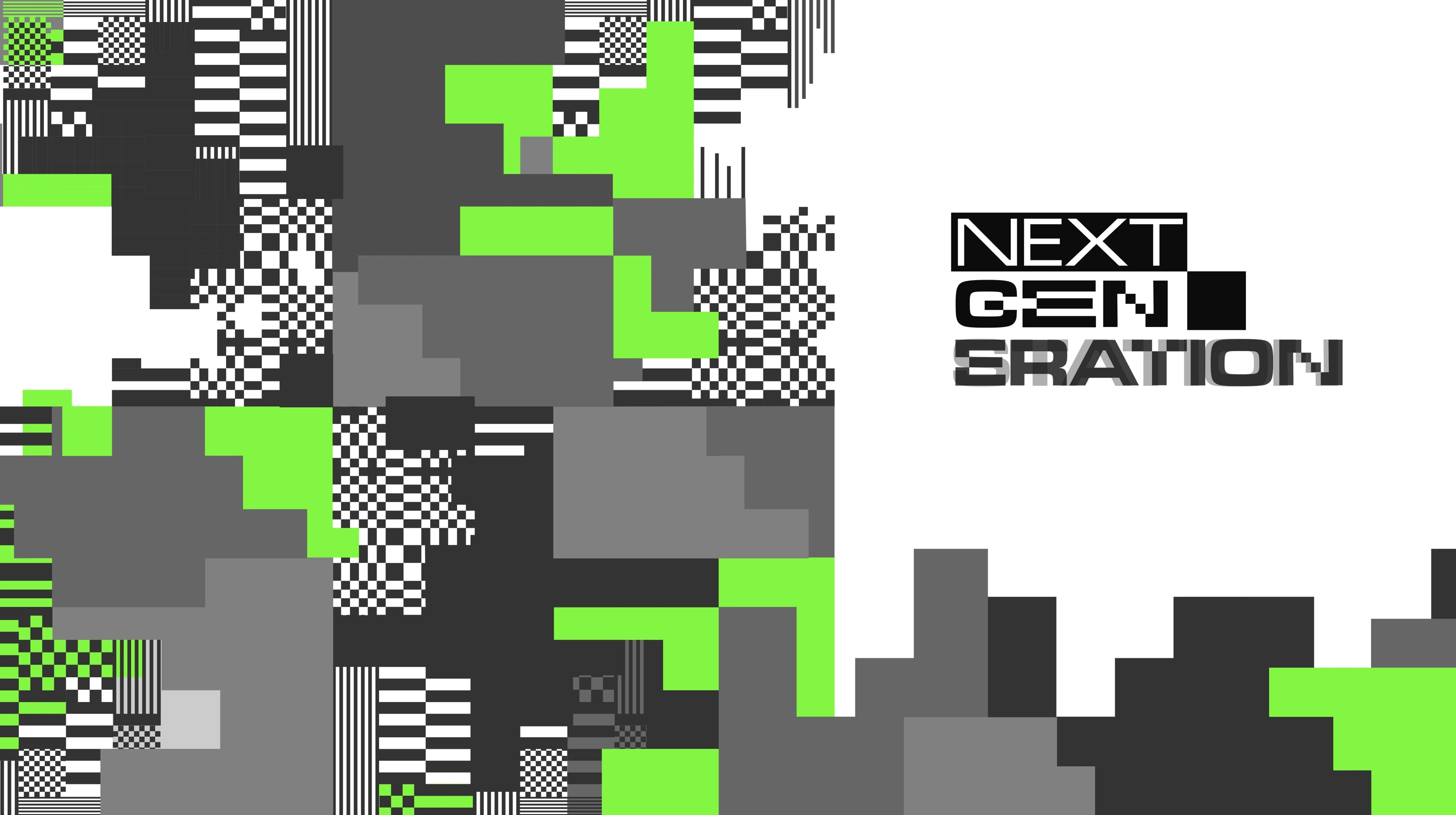
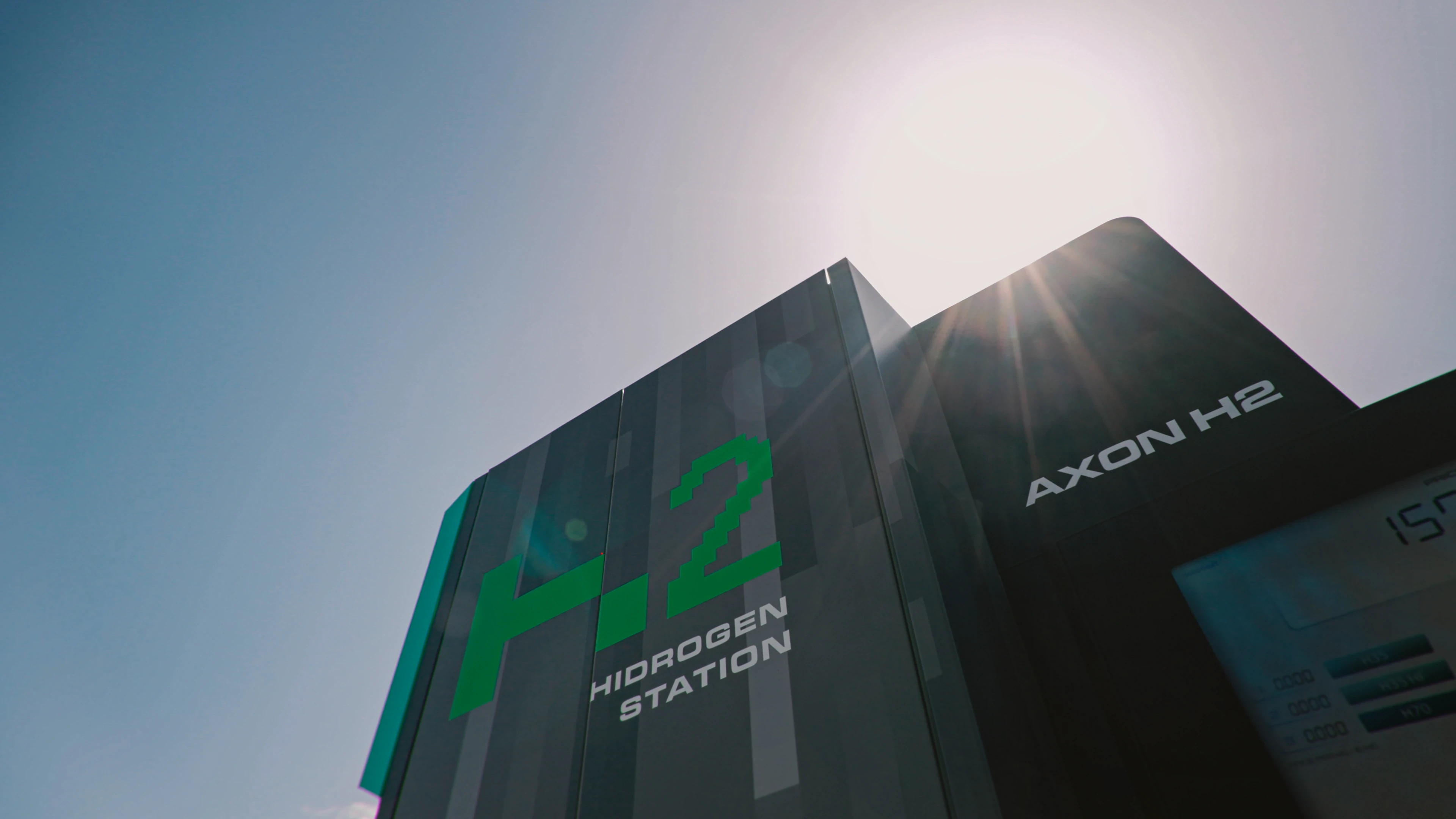
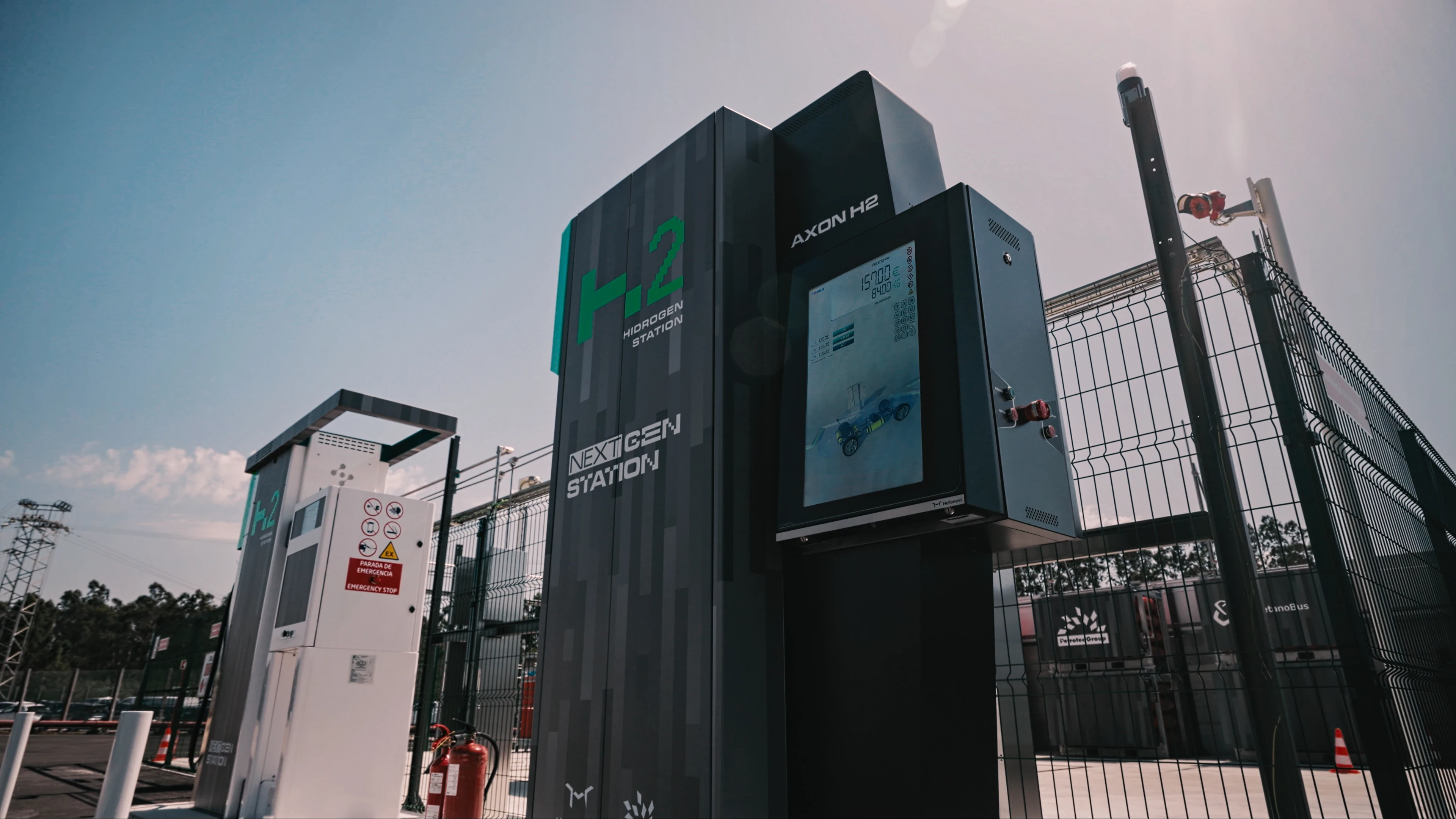
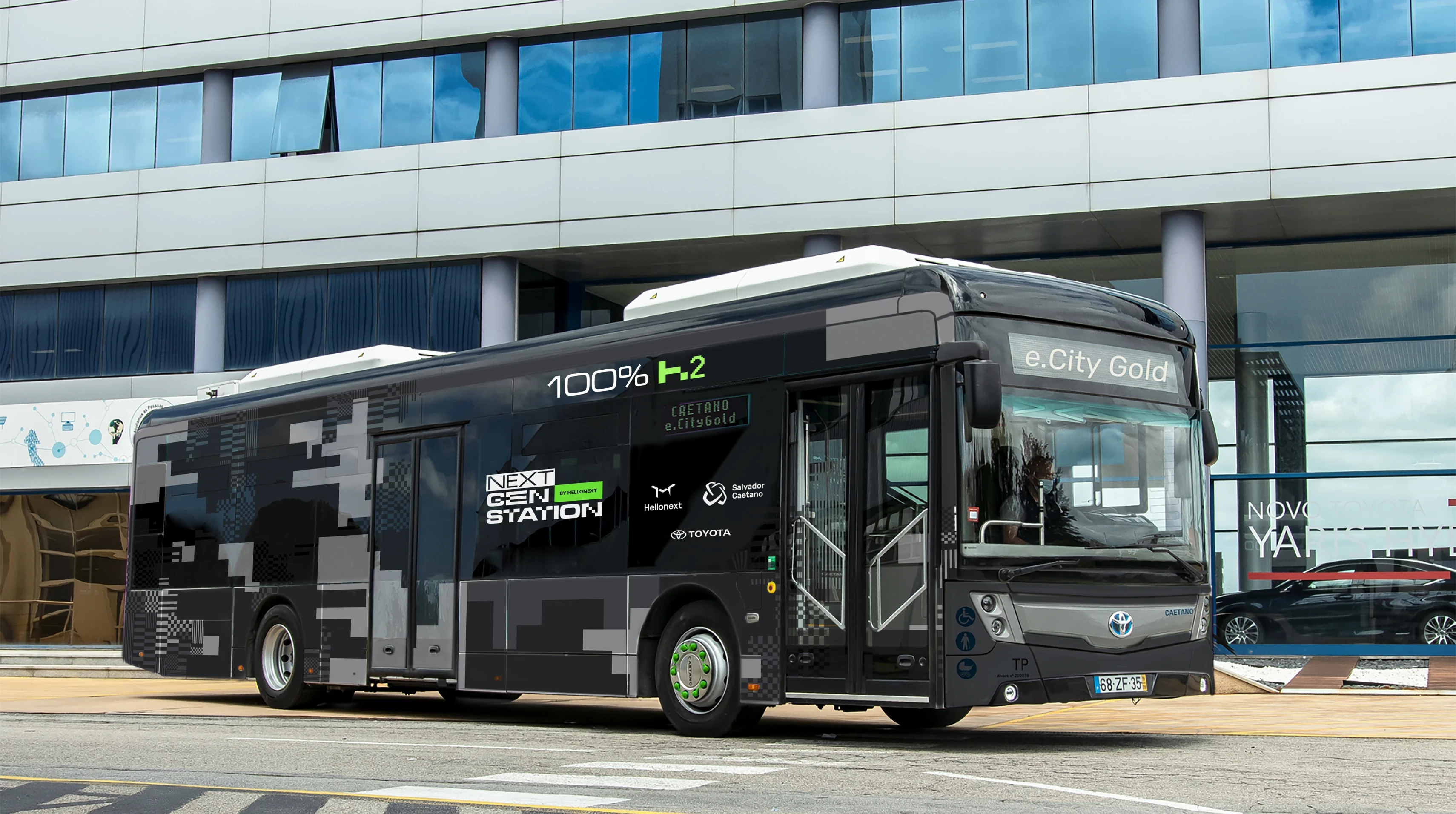
Visual Identity. The visual system draws from automotive prototype culture, specifically the camouflage wraps used on pre-release vehicles to conceal their final design. The visual code communicates: this is advanced, not yet fully revealed, ahead of its time. It gave the project a look that felt industrial and futuristic simultaneously, distinct from any partner's existing brand language.
Station & Bus Application. The identity extended into physical space: applied to the station infrastructure and to a branded CaetanoBus vehicle, creating a coherent presence that worked both as permanent installation and mobile activation.
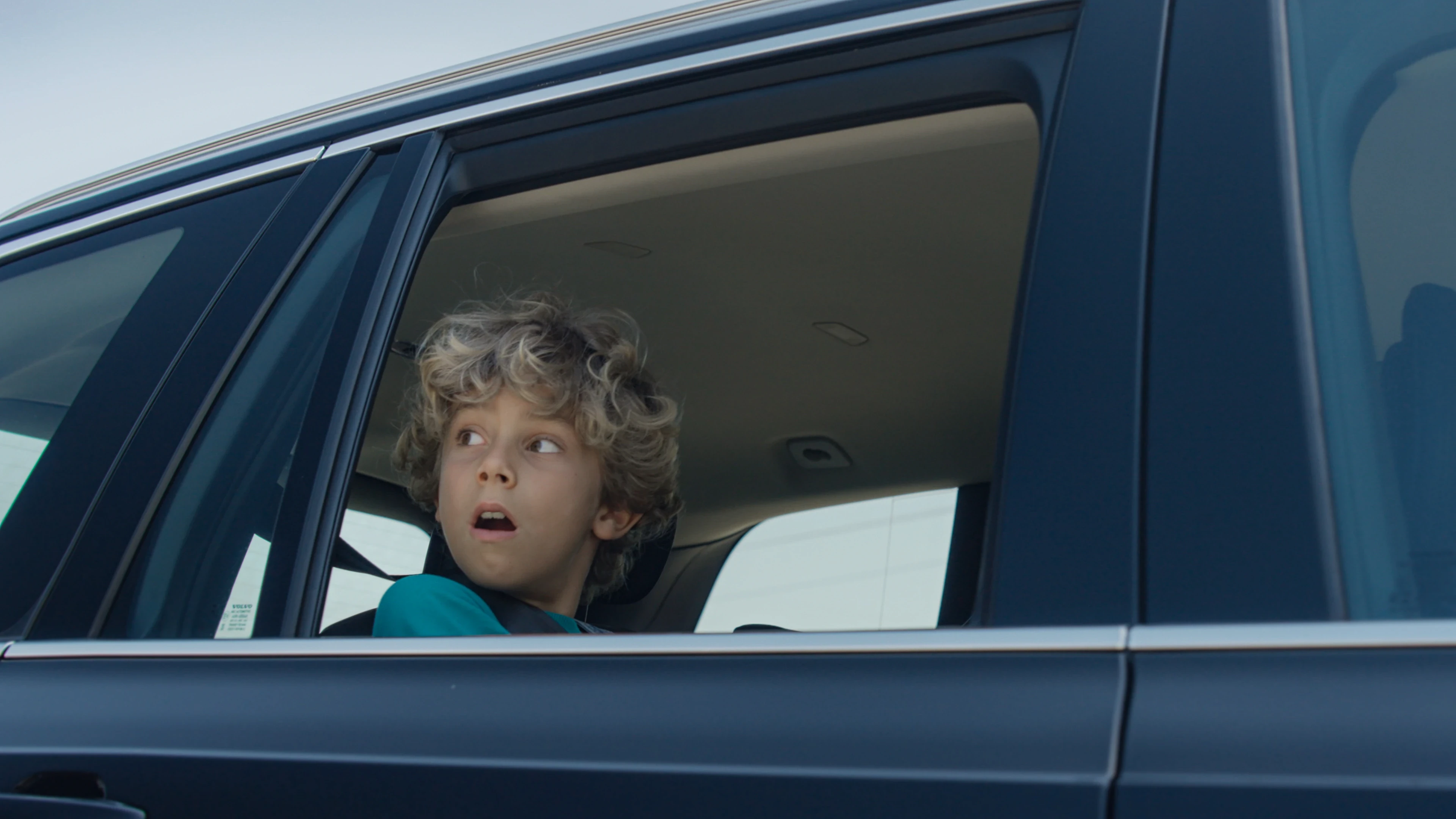
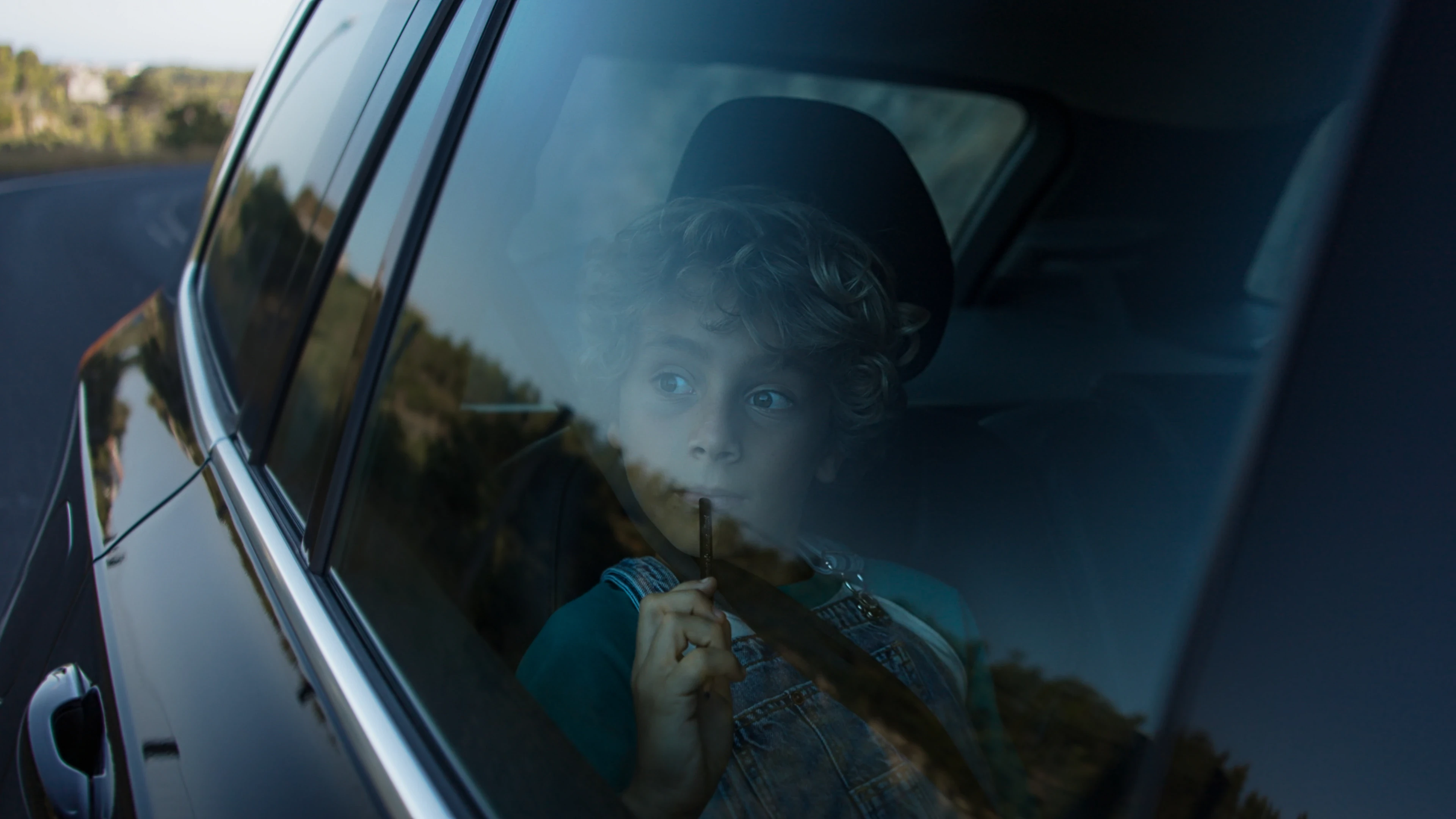
Hero Film. I wrote the full script, led casting, defined the visual approach, accompanied the shoot, and supervised post-production.
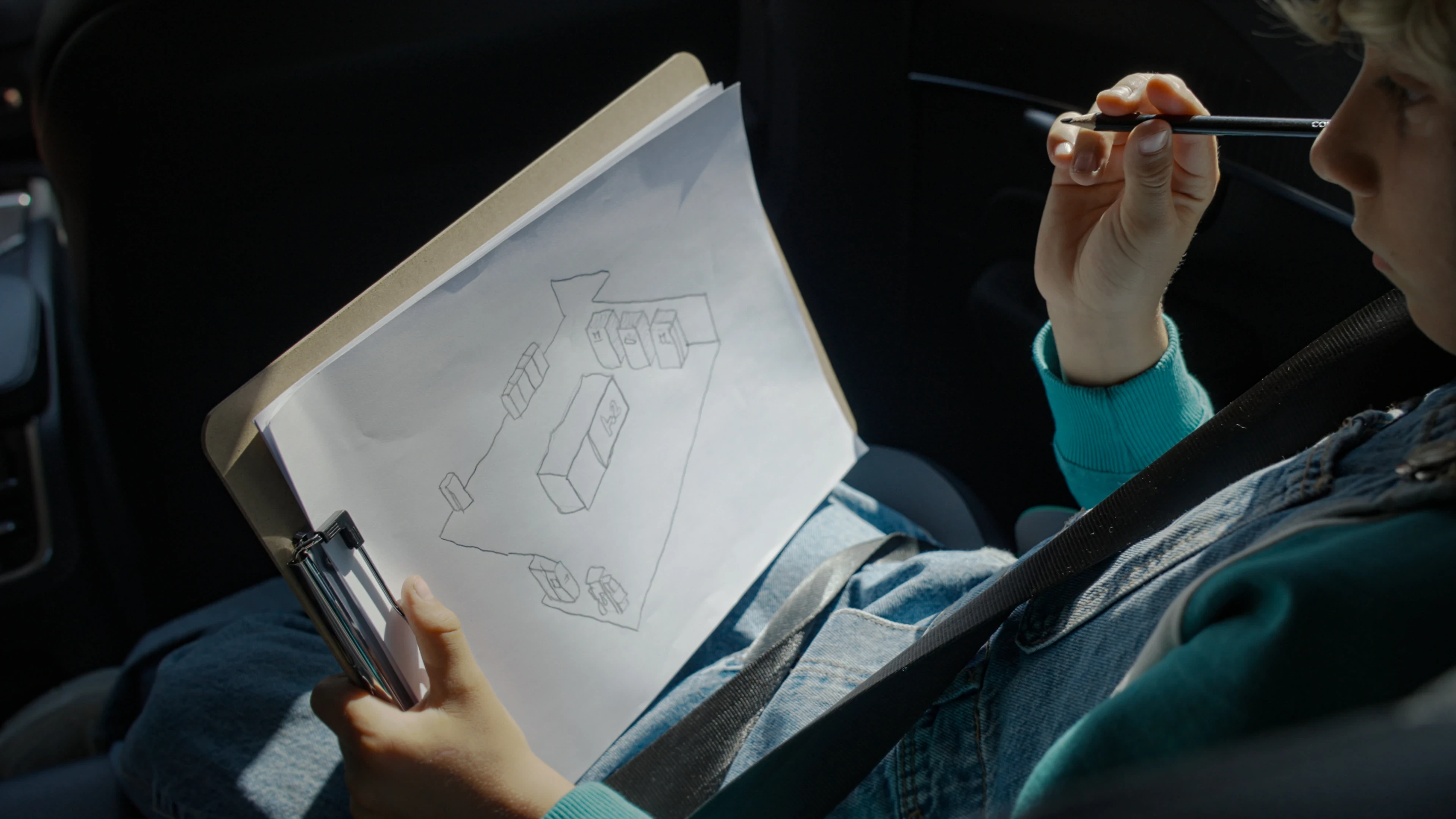
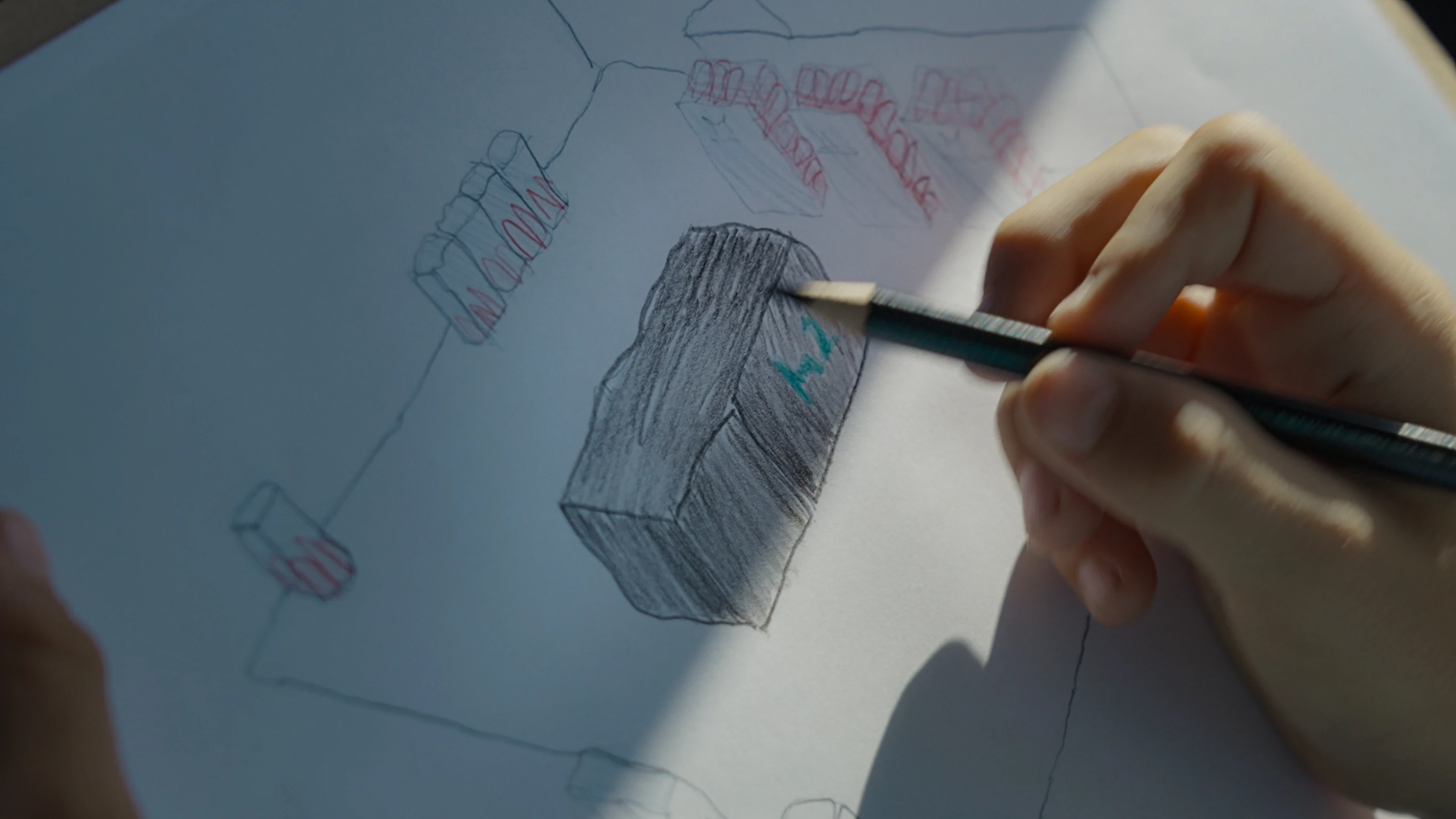
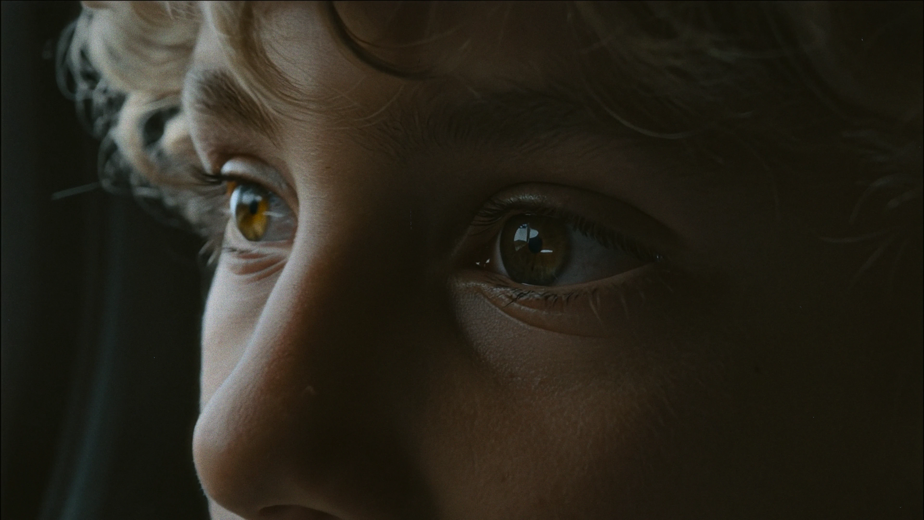
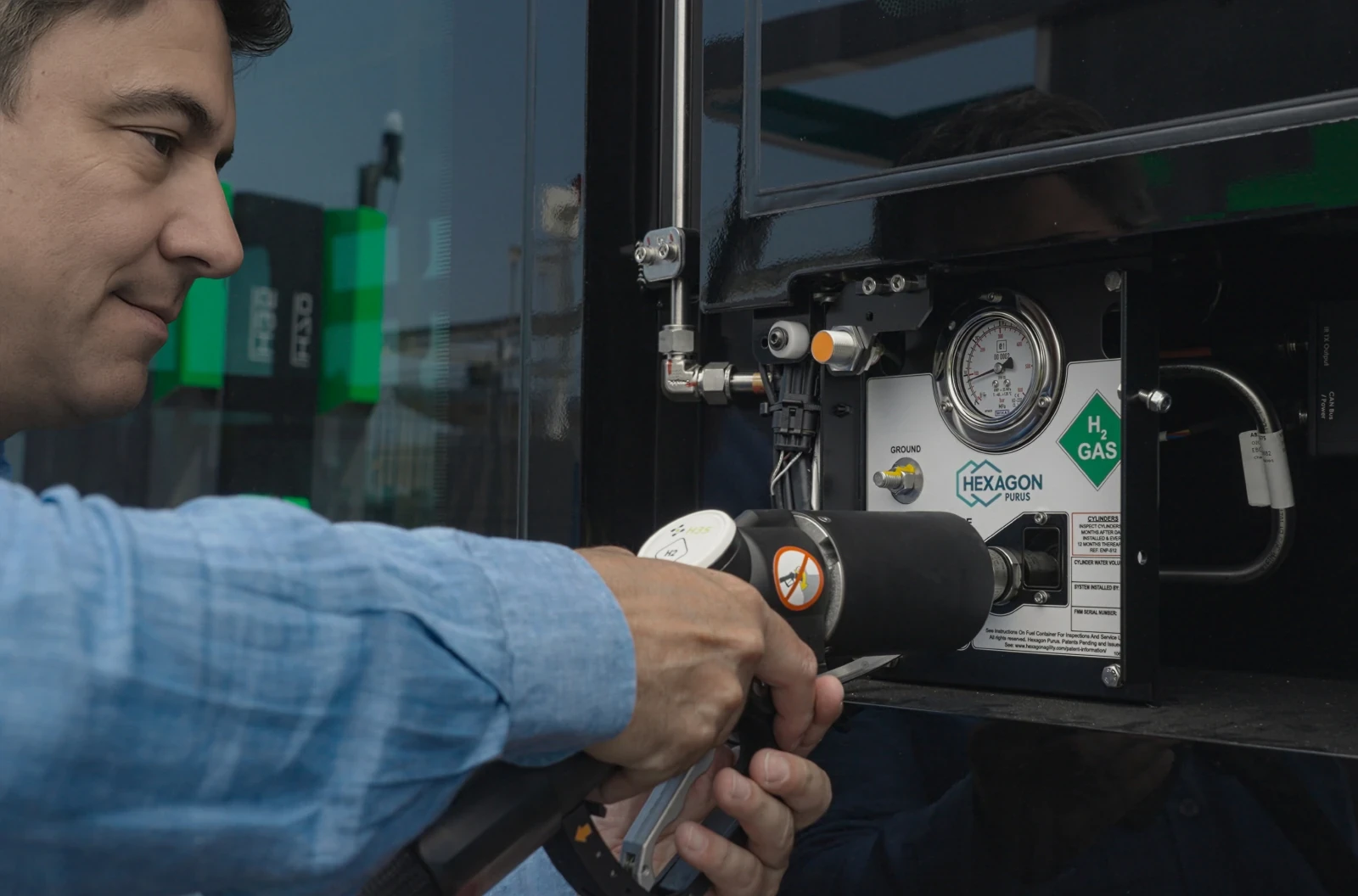
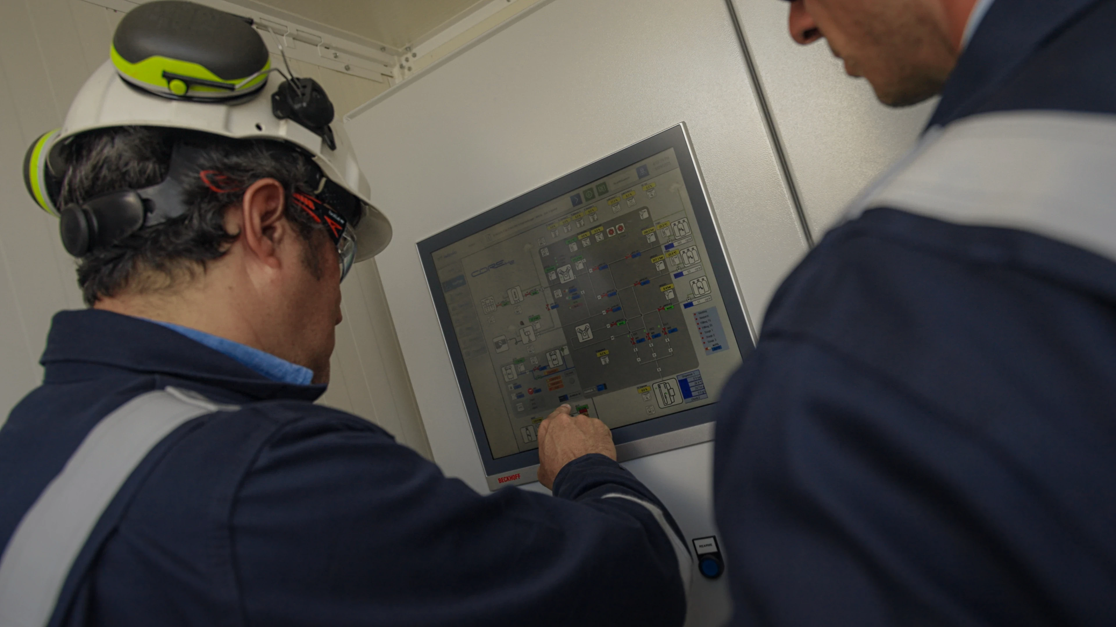
The film follows a child in the back seat of a car, drawing on a sketchpad, imagining what the future of mobility looks like. As the child narrates, the film cuts between imagination and reality: the Hellonext station, CORE H2 control system, AXON H2 dispenser, and the refuelling experience itself.
The narration is deliberately unpolished, full of a child's logic: hydrogen is "magic gas (the clean kind)," the station has "a huge brain that checks everything," and refuelling is "like a game." Every line maps directly to a real product feature, decoded through a child's eyes.
Landing Page. Designed the content architecture and UX structure for the project's launch page. Built as a self-contained digital briefing: narrative-led, visually driven, and conversion-ready for the LinkedIn campaign.
Launch System. The launch wasn't a single moment; it was a sequenced system:
Film → Landing page → Targeted LinkedIn campaign → World Hydrogen Summit 2025 presentation.
Each asset fed the next. The film drove traffic. The landing page held the story. The campaign reached decision-makers. The summit gave it a stage.
A multi-partner infrastructure investment became a single, ownable brand experience with its own name, visual language, and strategic voice.
The launch system was designed to reach beyond a single event: speaking to industry decision-makers, government audiences, and institutional partners through precisely targeted digital distribution, anchored by the World Hydrogen Summit 2025 presentation in Rotterdam.
The project reframed hydrogen refuelling: from technical complexity to intuitive, human experience, giving four distinct brands a shared platform that elevated all of them without diluting any.