Charging Change
Repositioning from product company to movement. A multi-energy, design-driven platform that makes decarbonisation feel actionable, human, and desirable.
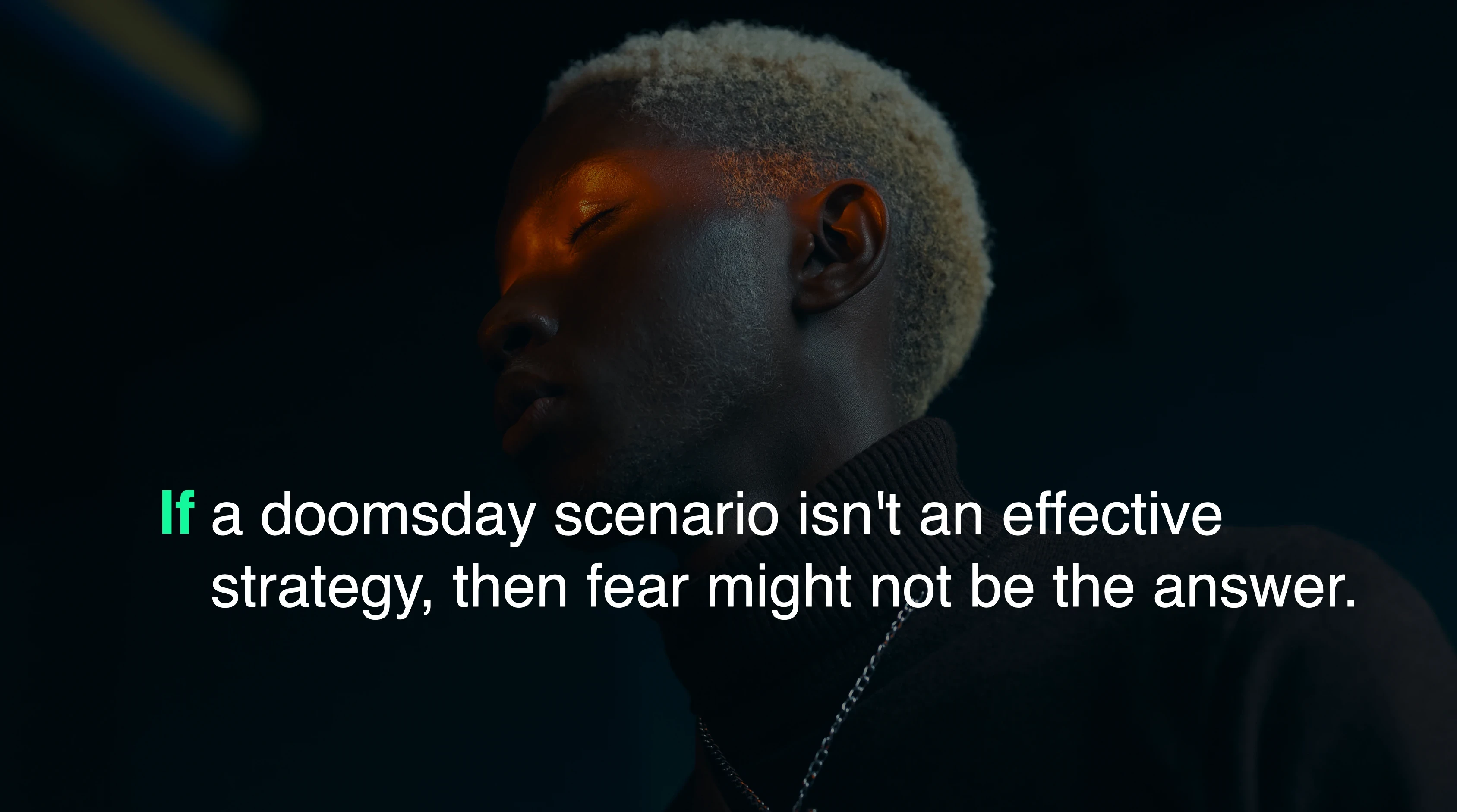
"If doomsday narratives aren't changing behaviour, the problem isn't awareness; it's approach. Hellonext would be built on action and desire."
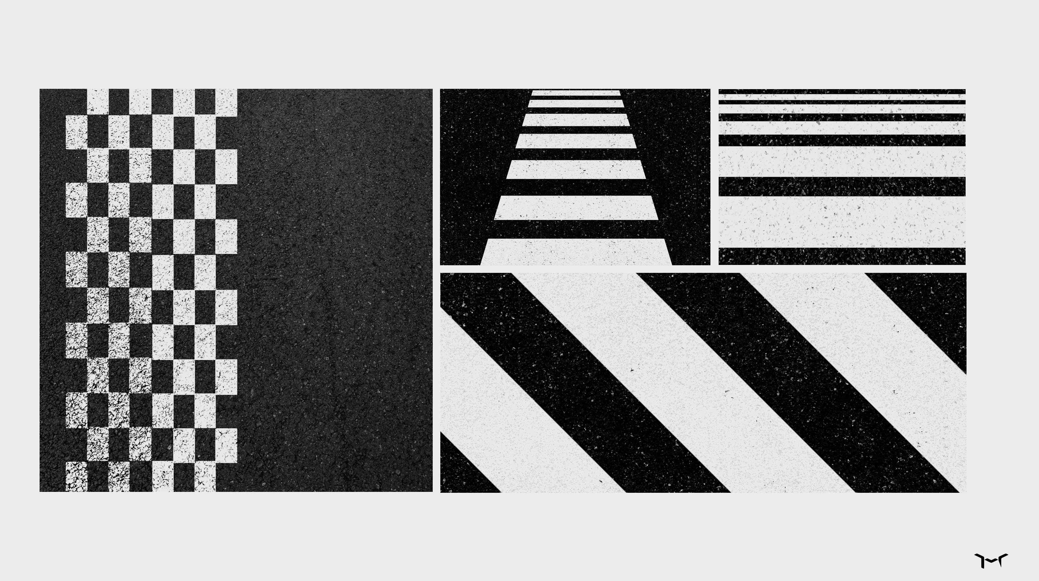
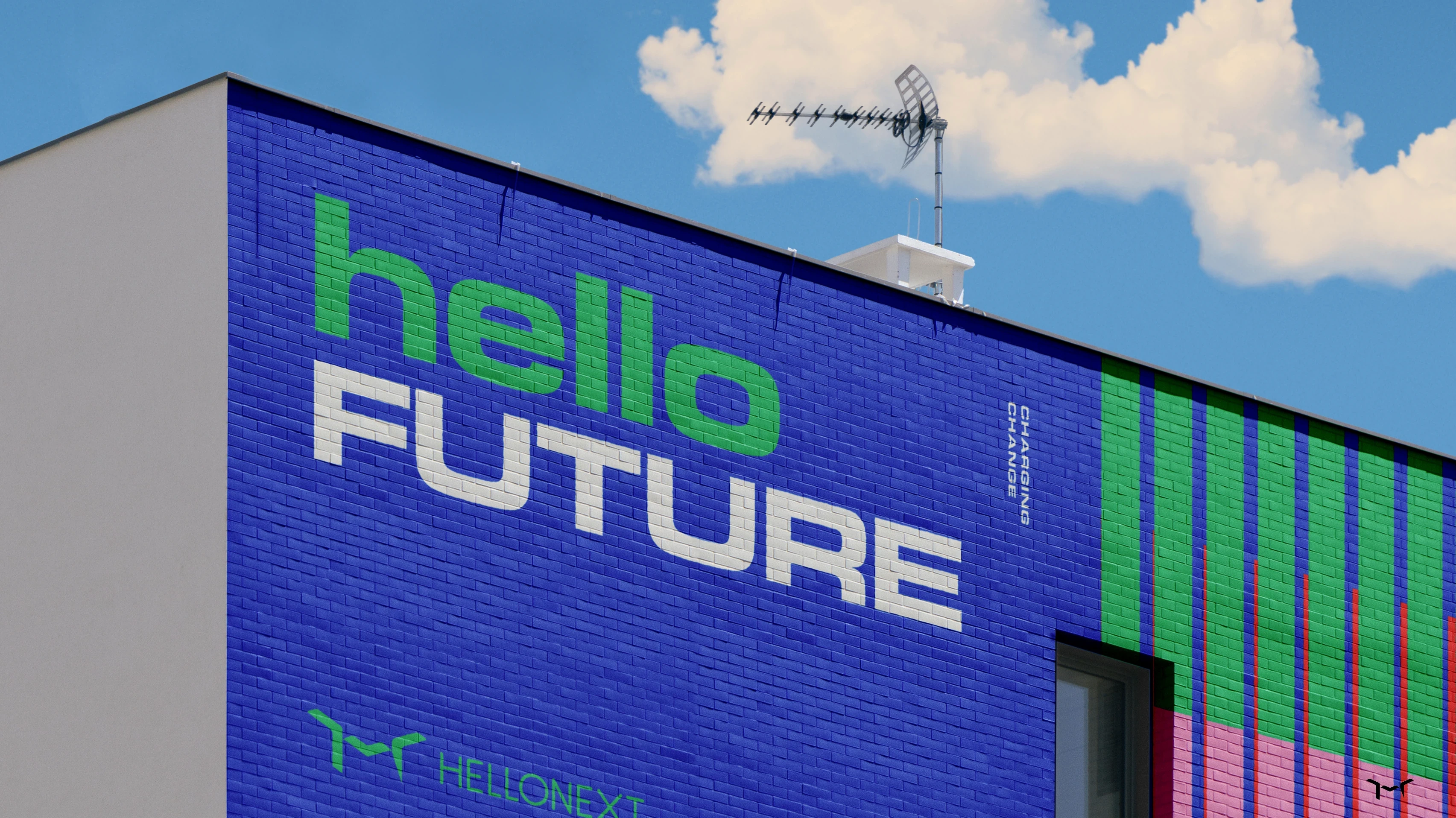
"Geometric language drawn from road signs and lane markings. Connecting the brand to mobility and motion at a structural level."
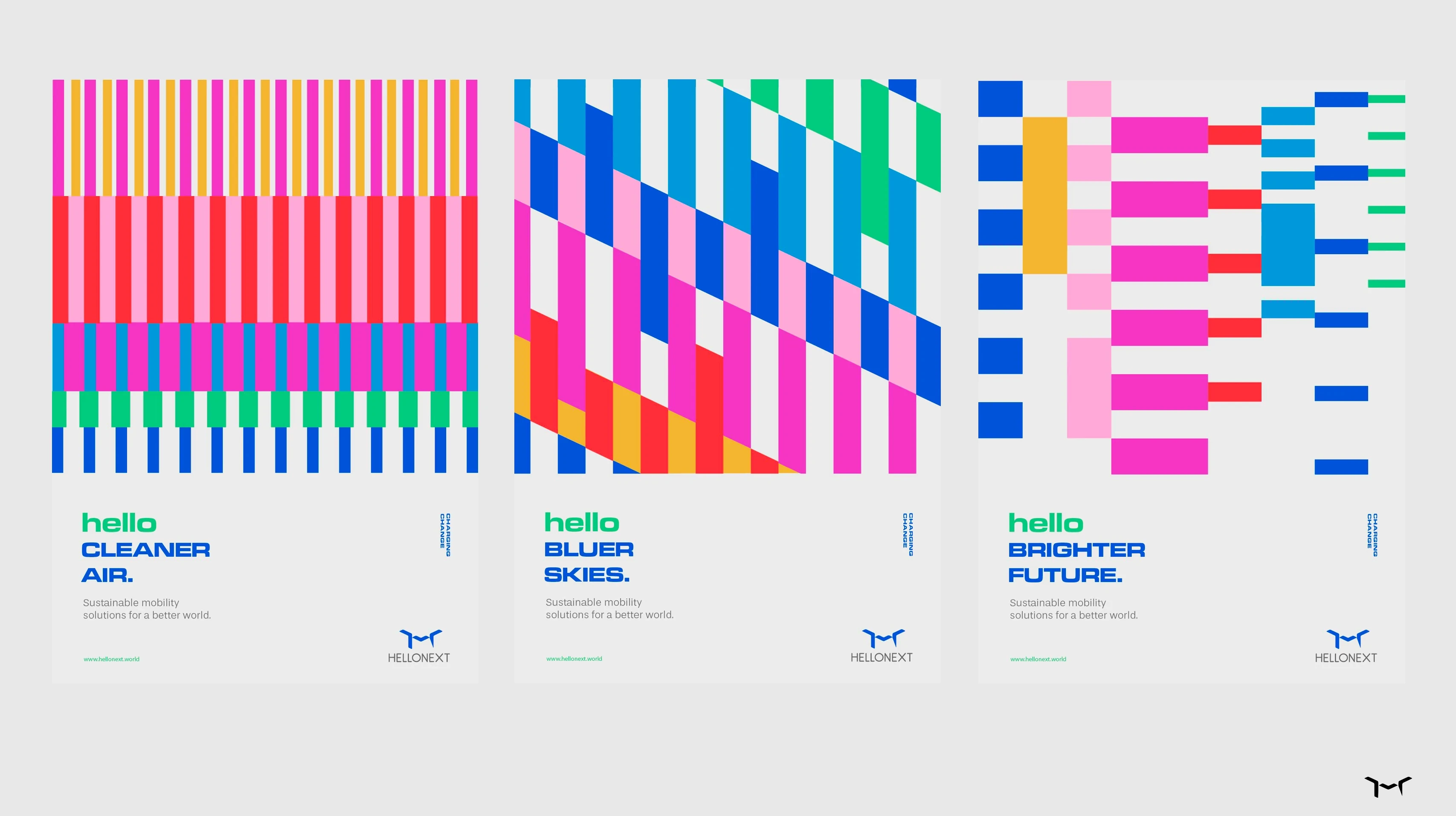
"A design philosophy closer to public art than corporate sustainability. Make infrastructure feel like a brand experience."
"B2B doesn't have to mean boring to boring. Hellonext would behave like a creative, activist brand: confident, joyful, operationally serious."
"Hellonext exists to empower and mobilise people to take part in the energy transition through beautifully designed products: simple to use, technologically advanced."
.webp)
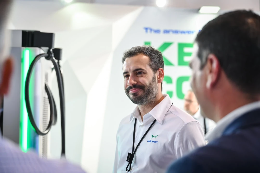

Hellonext rebranded from a commodity EV charger manufacturer into a multi-energy platform movement with a bold positioning that replaced "green fatigue" messaging with optimism and action. The rebrand included a distinctive visual identity, manifesto, and award-winning hydrogen dispenser UX/UI design.
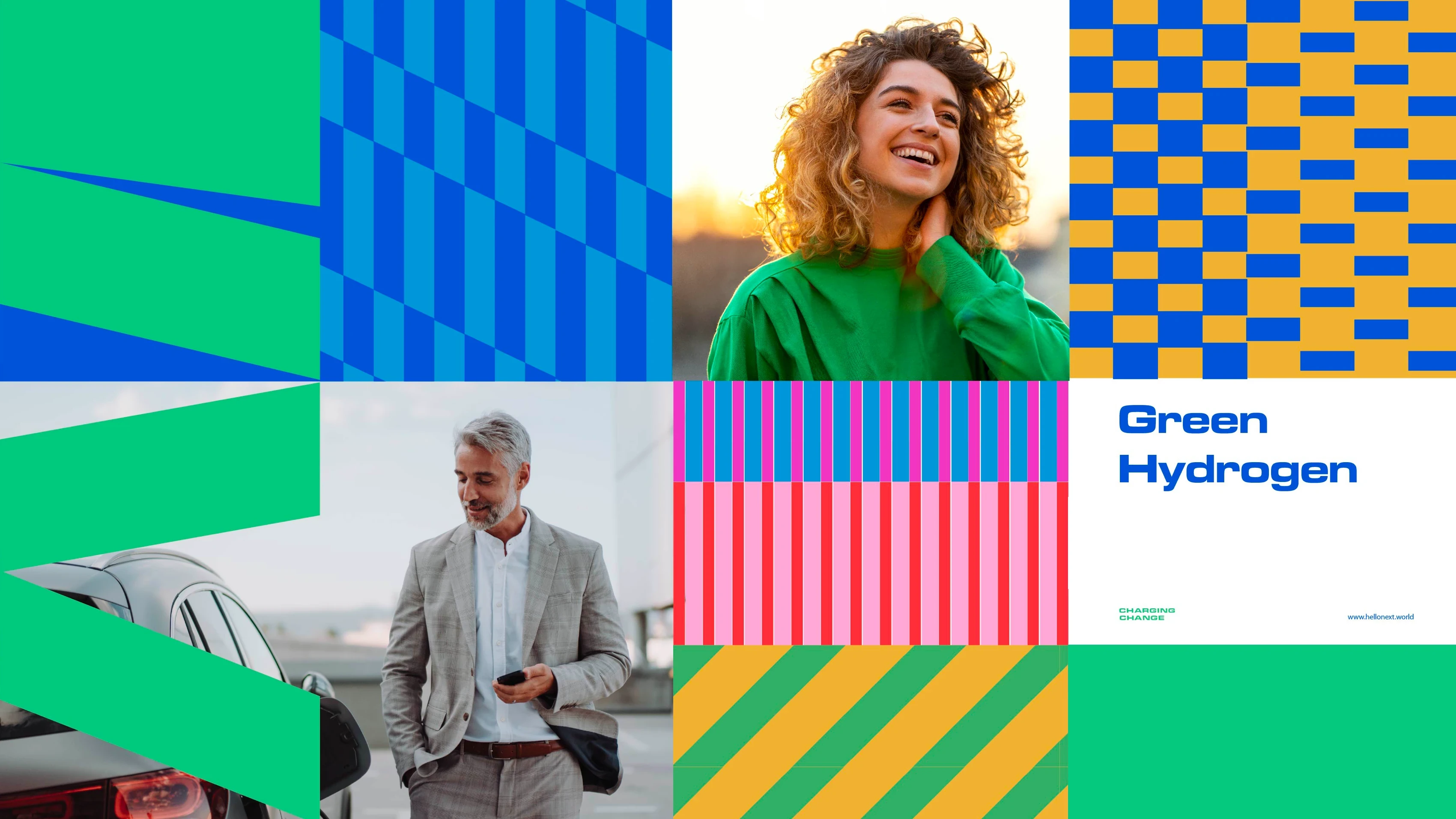
Hellonext began as an EV charger manufacturer (a category defined by commodity pricing, spec-sheet battles, and an industry-wide dependence on the same tired "green" language). But the business had already outgrown that box: hydrogen refuelling systems, BESS, and one of the most advanced H2 dispensers in the world, all built around a design-led approach to human-machine interaction.
The rebrand wasn't cosmetic. It was a repositioning from product company to movement. A multi-energy, design-driven platform that makes decarbonisation feel actionable, human, and desirable.
A commodity trap. In the EV charging sector, there is almost no product differentiation. The market runs on price, technical assistance costs, and charging speed. When a brand does innovate, the competition follows within months. Without a distinct brand, Hellonext would remain interchangeable.
A category drowning in cliché. "Protecting the environment." "In harmony with nature." "Taking care of the planet." The entire clean energy sector speaks in the same language, and the result is green fatigue. A space where everyone tries to be different by doing exactly the same thing.
A fear-based narrative that doesn't work. The UN Secretary-General declared that "the era of global boiling has arrived." Yet despite doomsday headlines, apocalyptic imagery, and escalating data, behaviour hasn't shifted. If fear were an effective strategy, it would have worked by now.
A brand that had already evolved past its own story. Hellonext was no longer just making chargers. It was building hydrogen systems where safety and UX are mission-critical. The brand needed to catch up with the business.
So instead of jumping too soon to the wrong conclusions, I applied first-principles thinking: Who are we? Is there a central belief that can guide everything Hellonext does?
Insight: Fear doesn't move people. Optimism does. The turning point was a simple reframe: if doomsday narratives aren't changing behaviour, the problem isn't awareness; it's approach. Climate communication has been built on guilt and fear. Hellonext would be built on action and desire.
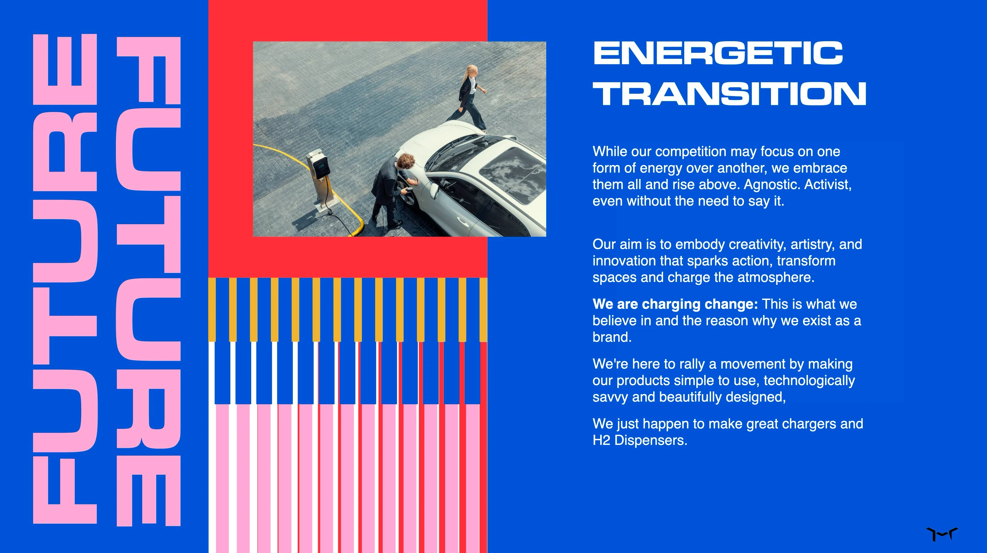
Positioning: Above the energy debate. While competitors bet on one form of energy over another, Hellonext embraces them all. Agnostic. Multi-energy. The brand would stand above the either/or, not as a diplomatic choice, but as a strategic advantage.
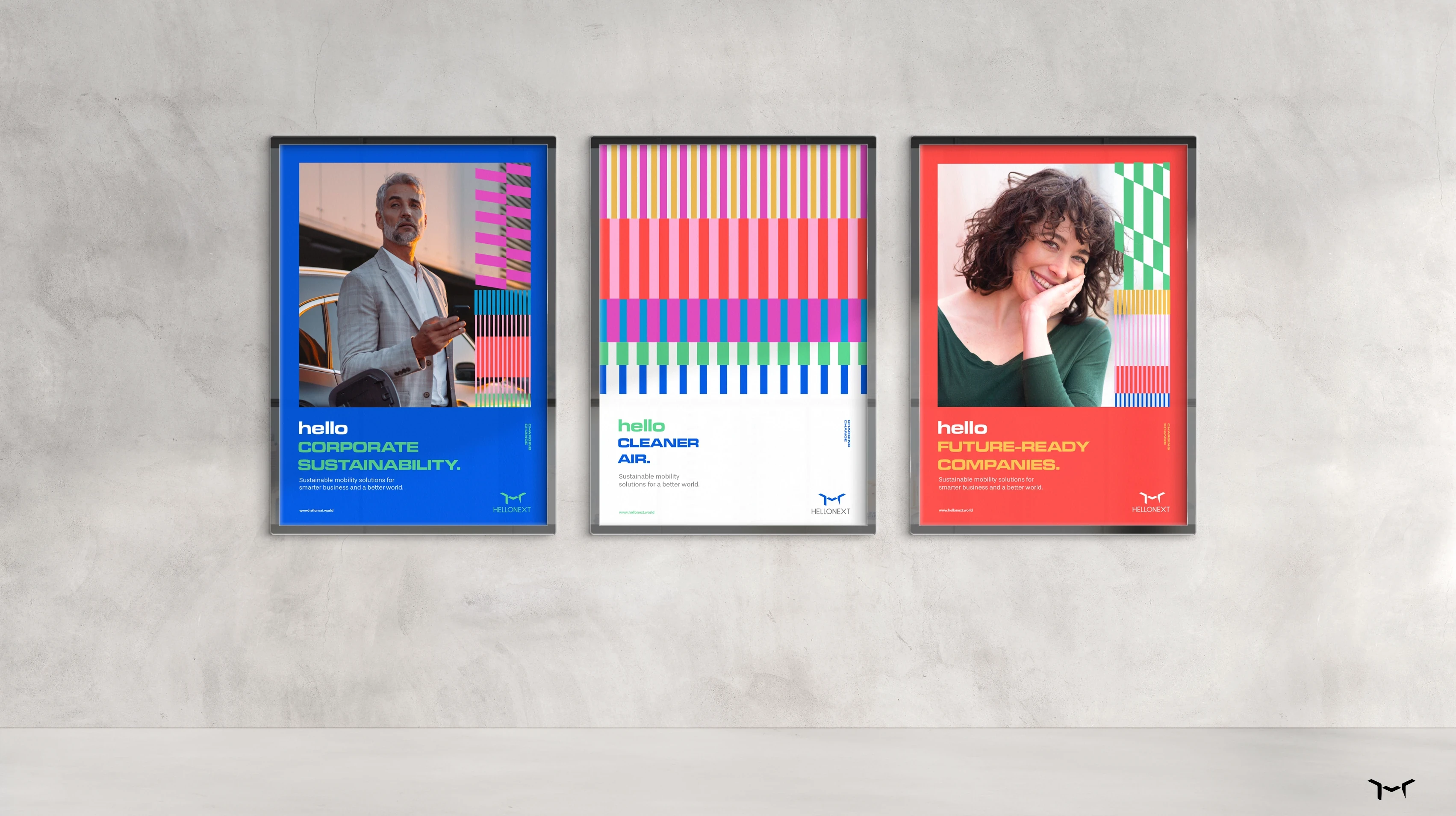
Brand idea: Charging Change. Not a tagline. A behavioural platform. The decarbonisation journey shouldn't be about products; it should be about what those products mean to the people who use and see them. Hellonext exists to empower and mobilise people to take part in the energy transition. The way it does that: beautifully designed products, simple to use, technologically advanced. It just happens to make great chargers and HRS.
Brand posture: Brave to Brave. B2B doesn't have to mean boring to boring. Hellonext would behave like a creative, activist brand (confident, joyful, operationally serious), closer to Apple's approach to a commodity than to a typical infrastructure supplier.
Manifesto & Voice. The brand voice was built around a central conviction: we keep it cool (the planet, our clients' businesses, our company, ourselves). As long as we have a choice, we choose to envision a better world and never let fear guide us.
The tone is direct, optimistic, and unapologetically creative for a B2B brand. It replaces sustainability jargon with language that moves people. Not through guilt, but through the desire to be part of something worth joining.
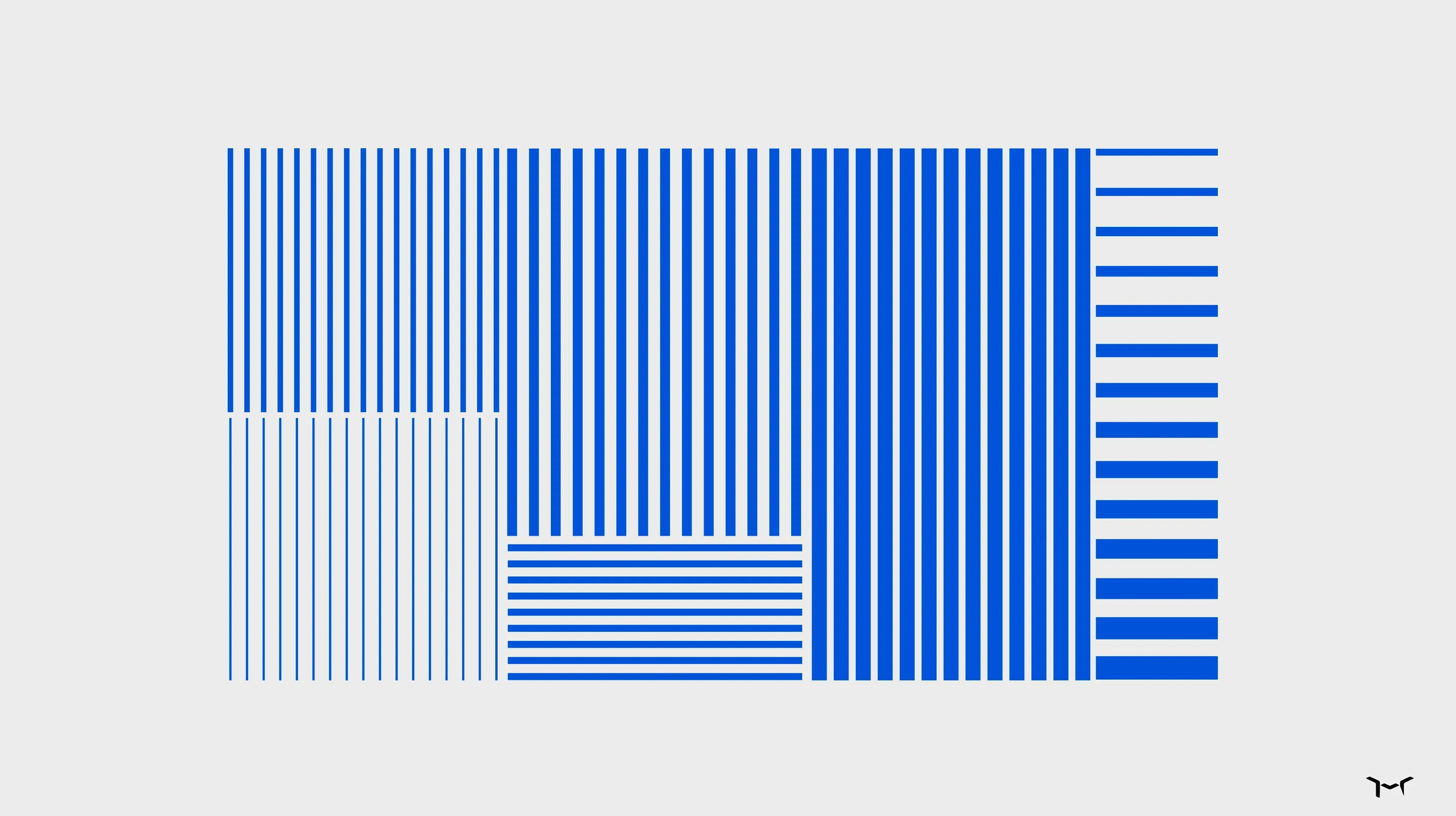
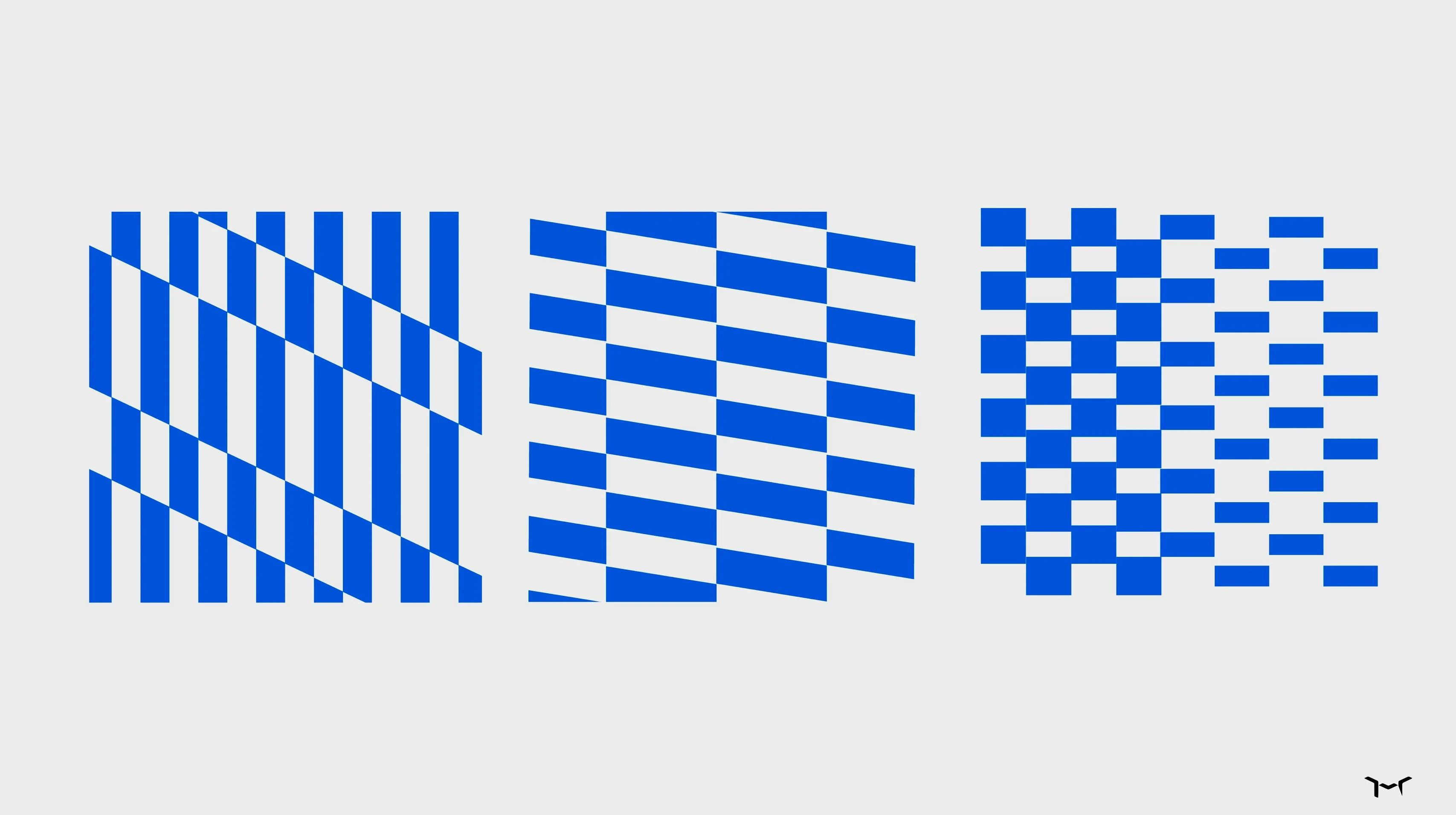
Visual Identity Direction. I directed a visual system designed to break every code in the clean energy category:
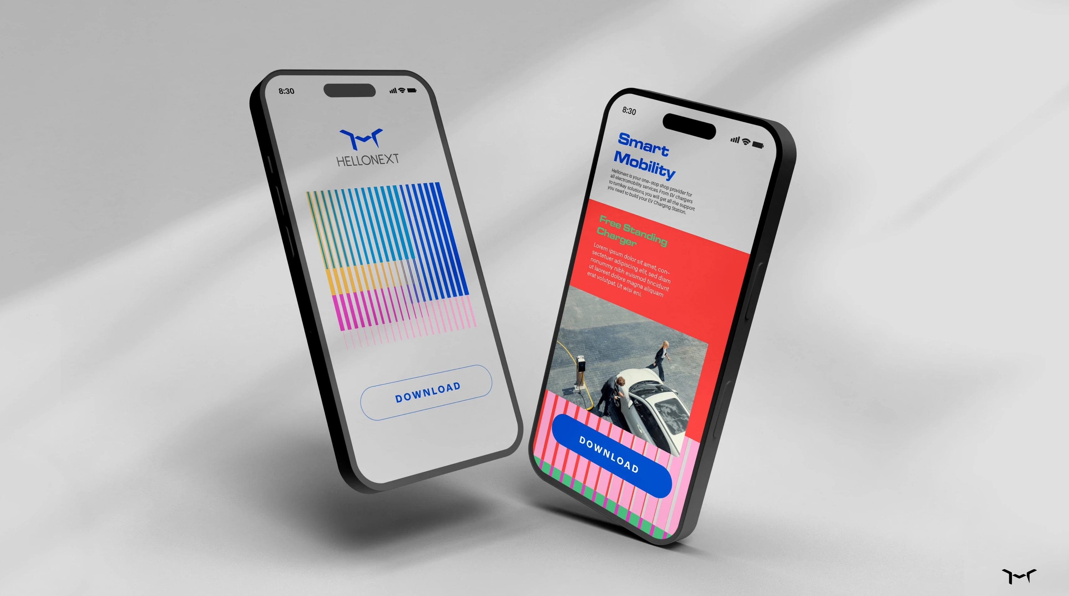
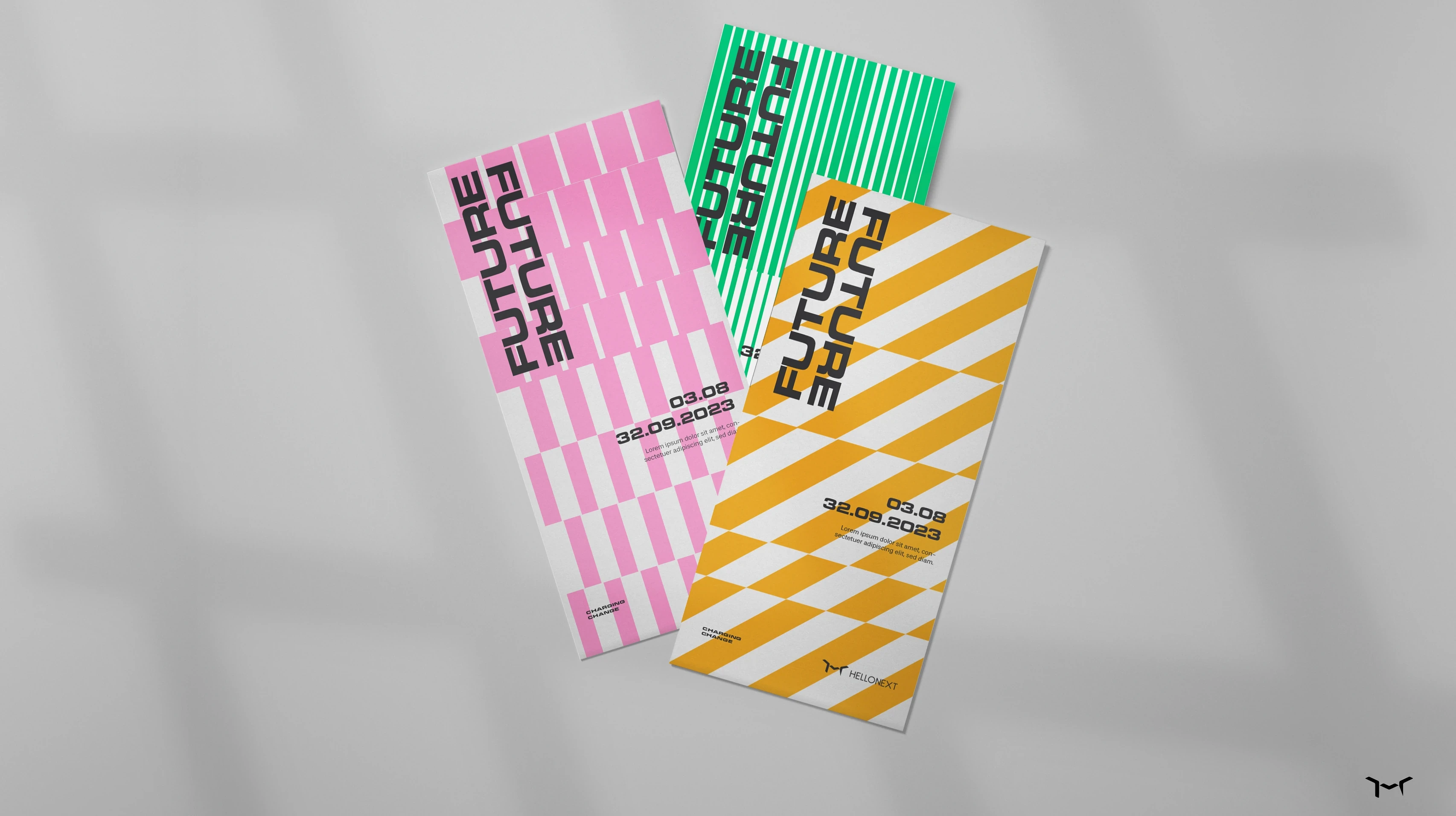
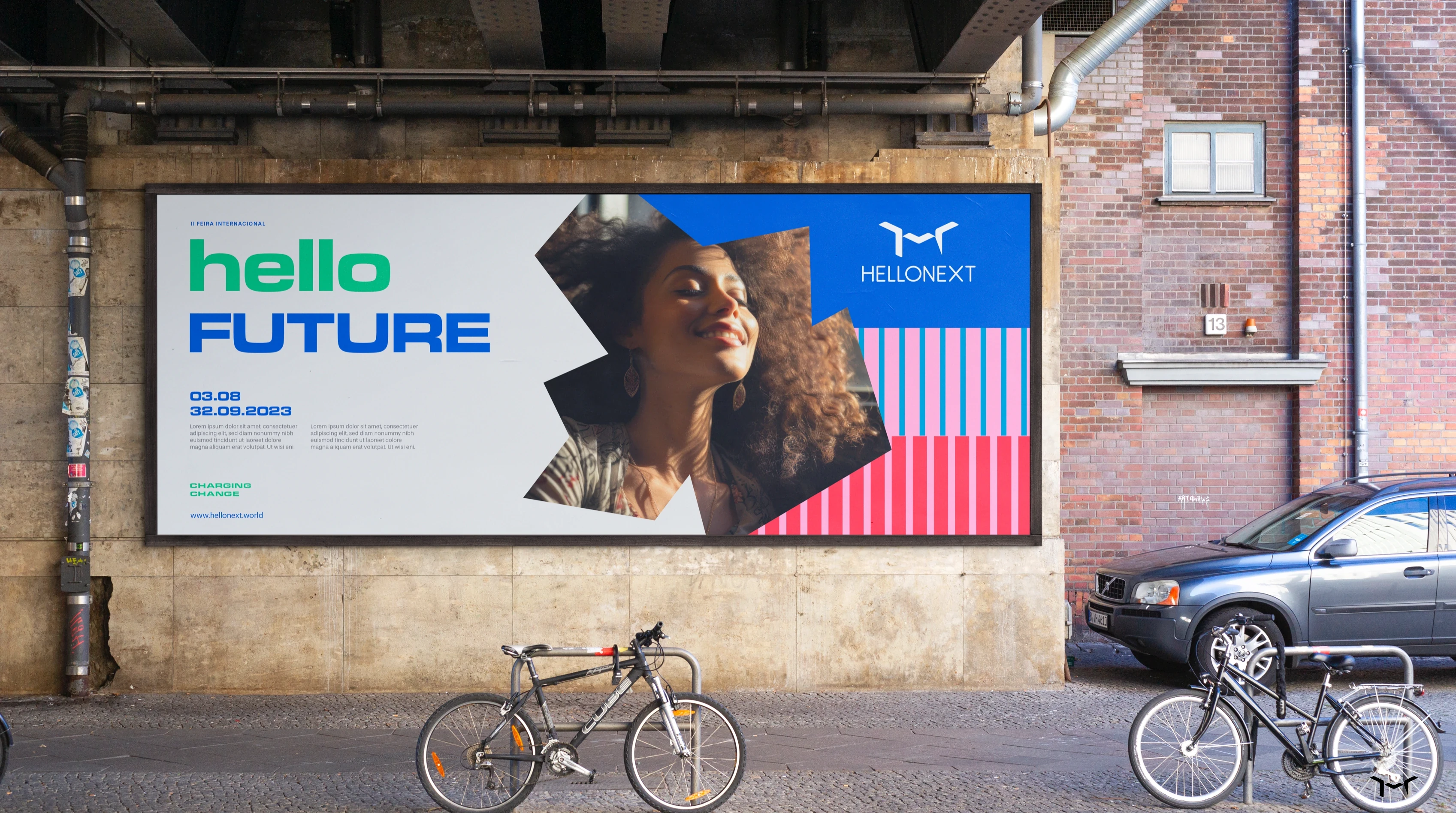
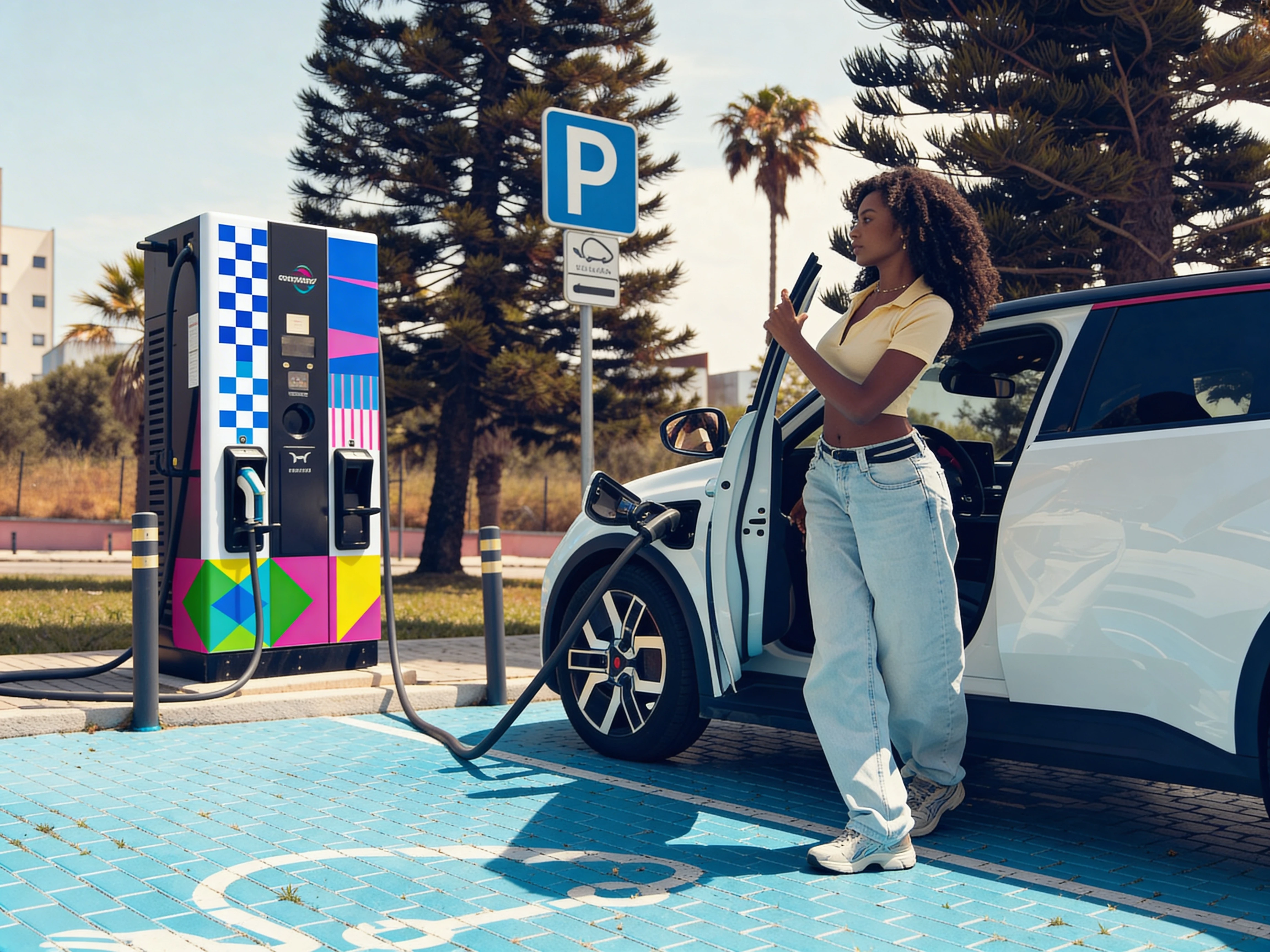
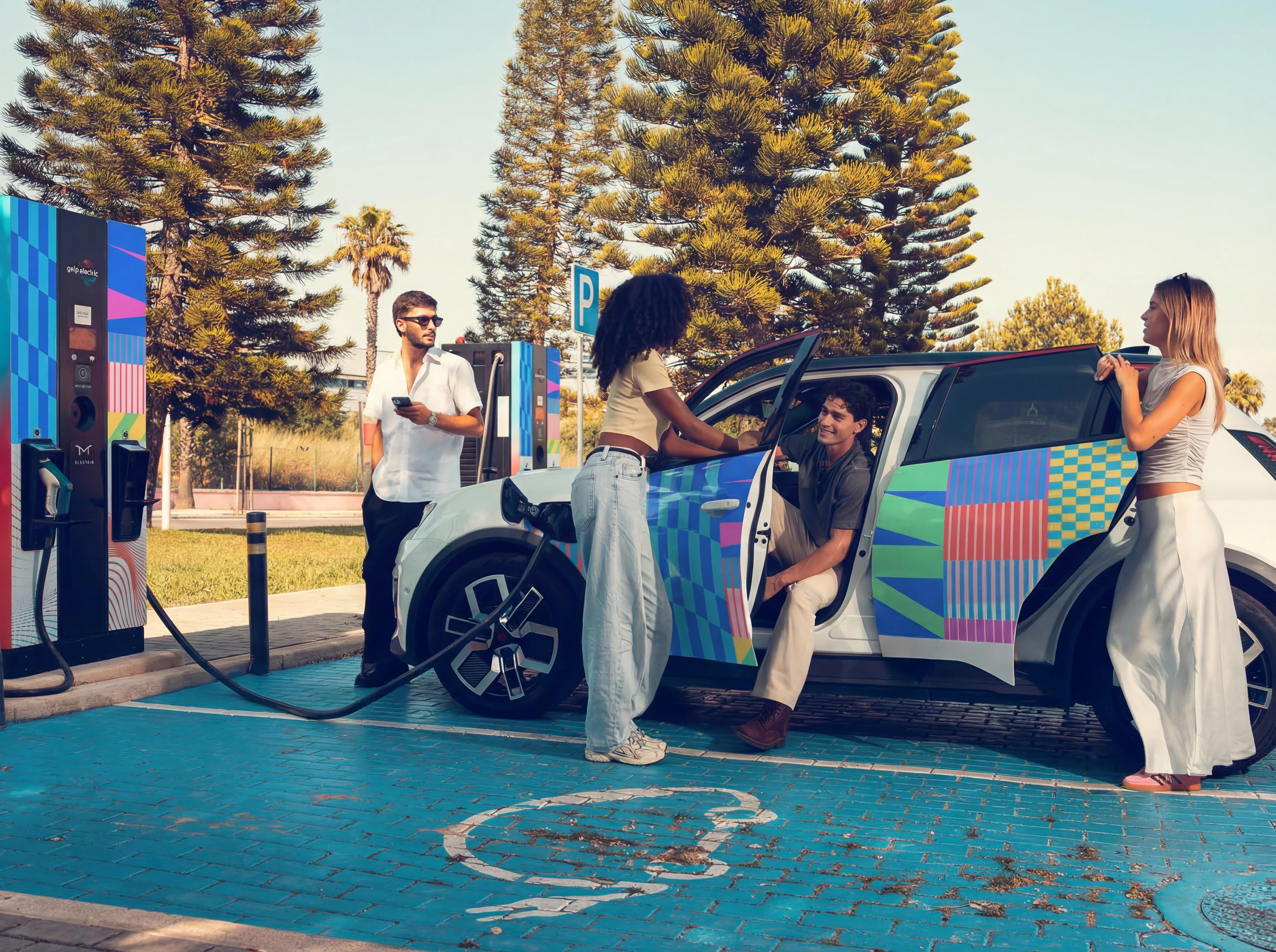
Geometric language drawn from road signs and lane markings, connecting the brand to mobility and motion at a structural level. Shapes work independently or combine into modular patterns that express progress, evolution, and kinetic energy.
A bold, high-contrast colour palette that refuses the expected greens and blues. Every colour choice was made to signal: this is not the same category you're used to.
A design philosophy closer to public art than corporate sustainability (inspired by artists like Camille Walala). The ambition: make infrastructure feel like a brand experience. Joyful, fresh, unmistakable.
The system was built for scalability: from brand communications to product skins, from digital interfaces to physical station environments.
Naming Rationale. Although naming preceded the rebrand, the strategic logic behind the name became a scalable system in its own right:
Hello: human tone, approachability, warmth. The respect for the human side of man-machine interaction. A word that opens doors.
Next: innovation, edge technology, the future arriving now. What's coming, not what's been.
This became an operational tool: all key communications open with "Hello..." (signalling novelty, momentum, and positive progress). It reinforces brand recognition, explains the name, and creates a verbal identity that scales across markets and formats.
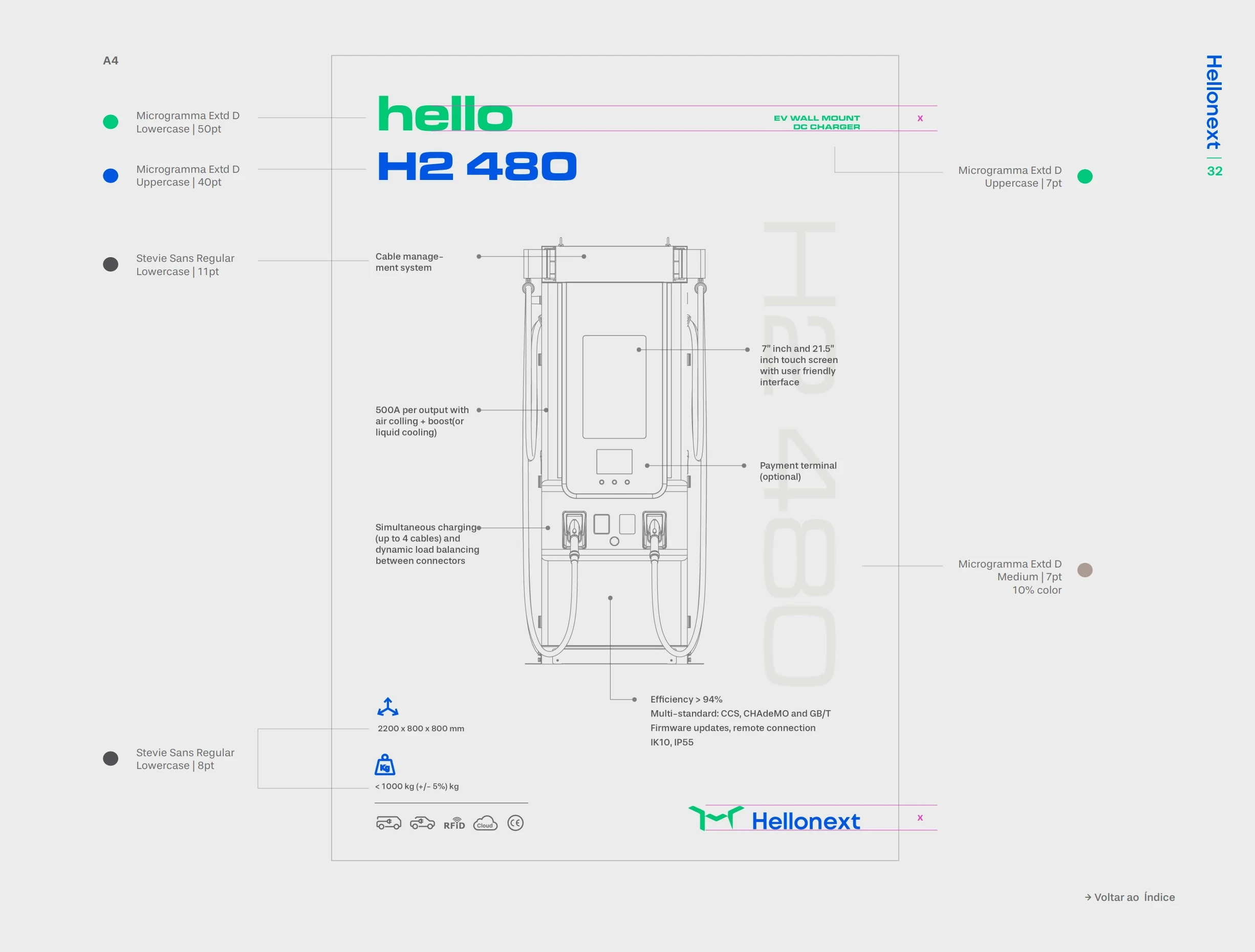
H2 Dispenser UX/UI Concept. Beyond brand, I led the conceptual design of the hydrogen refuelling interaction, mapping the full user flow and experience principles for Hellonext's H2 dispenser system.
The challenge: hydrogen refuelling is a safety-critical operation that most people have never encountered. The experience needed to feel guided, clear, and calm. Building trust through interface design, not through reassurance copy.
The principles: step-by-step progressive disclosure, intuitive animation cues at each stage, safety confirmation built into the flow (not bolted on), and a visual language consistent with the brand identity. The result is arguably the most user-friendly hydrogen dispenser interface in the market.
Hellonext went from an EV charger manufacturer with a logo to a repositioned, multi-energy brand with a strategic spine and a creative system built to scale.
Charging Change became the organising idea across all brand touchpoints: from product development to communications to physical presence.
The visual identity broke category conventions and gave Hellonext an ownable aesthetic in a sea of interchangeable competitors.
The H2 dispenser UX/UI concept set a new benchmark for human-machine interaction in hydrogen refuelling, proving that safety-critical systems can be designed to feel intuitive, not intimidating.
The brand now operates as a platform, not a product company, capable of expanding into new energy verticals without losing coherence or distinctiveness.