Opening Mobility
Full strategic and creative transformation: from repositioning and brand architecture to identity, product communication, trade show experiences, and internal culture.
"A unified multi-energy brand platform built around a single purpose and a single strategic idea that became an operating system for decisions, culture, and innovation."

"The identity feels engineered because it is."
"Real work. Real people. No fakes."

"A logo that works like a design system, not a stamp."

"Opening Mobility became the organising principle for everything: product launches, trade show experiences, recruitment, internal culture, digital presence, and industry positioning."


Petrotec Group had world-class engineering but no brand visibility. I led a full strategic transformation: repositioning, brand architecture, identity, and culture. This created Opening Mobility, a unified multi-energy brand platform that became an operating system for decisions, culture, and innovation across three distinct entities.
Petrotec Group had world-class engineering across fuel, EV charging, and hydrogen. But the brand system didn't express that leadership. The portfolio spoke with one blurred voice, hierarchies were invisible, and top-tier products lacked market visibility.
I led a full strategic and creative transformation: from repositioning and brand architecture to identity, product communication, trade show experiences, and internal culture. The result: a unified multi-energy brand platform built around a single purpose (We keep the world moving) and a single strategic idea (Opening Mobility) that became not just a positioning, but an operating system for decisions, culture, and innovation.
Top-tier engineering, zero brand visibility. Petrotec was building some of the most advanced energy infrastructure in Europe: fuel systems, EV chargers, hydrogen solutions. But the market didn't know it. The brand wasn't telling the story the products deserved.
Two brands communicating as one. Petrotec Group (the institutional parent) and Petrotec (the manufacturer) spoke in the same visual and verbal language. This created confusion in the market, diluted both brands, and made it impossible to build distinct equity for the group versus the product line.
Messaging that blurred uniqueness. Without a clear hierarchy, purpose, or narrative framework, every touchpoint was an improvisation. Sales, HR, product, and leadership teams each told their own version of what Petrotec was. The brand needed a single spine.
B2B defaults to boring. The energy infrastructure category communicates in spec sheets, stock photography, and corporate blue. Petrotec needed to break that pattern without losing the credibility that B2B demands.
The central idea: Opening Mobility. No matter the powertrain, whether fuel, electric, hydrogen, Petrotec keeps the world moving. Opening Mobility isn't a tagline. It's the strategic platform that organises every brand decision: what we build, how we communicate, who we hire, how we show up at a trade show, how we answer the phone. A brand strategy that doesn't live in a PowerPoint deck; it's how the company operates.
The purpose: We keep the world moving. This became the North Star. Not an aspiration. A fact. Petrotec's engineering literally enables mobility across energy types. The purpose doesn't pick sides in the energy debate. It stands above it: multi-energy, agnostic, essential.
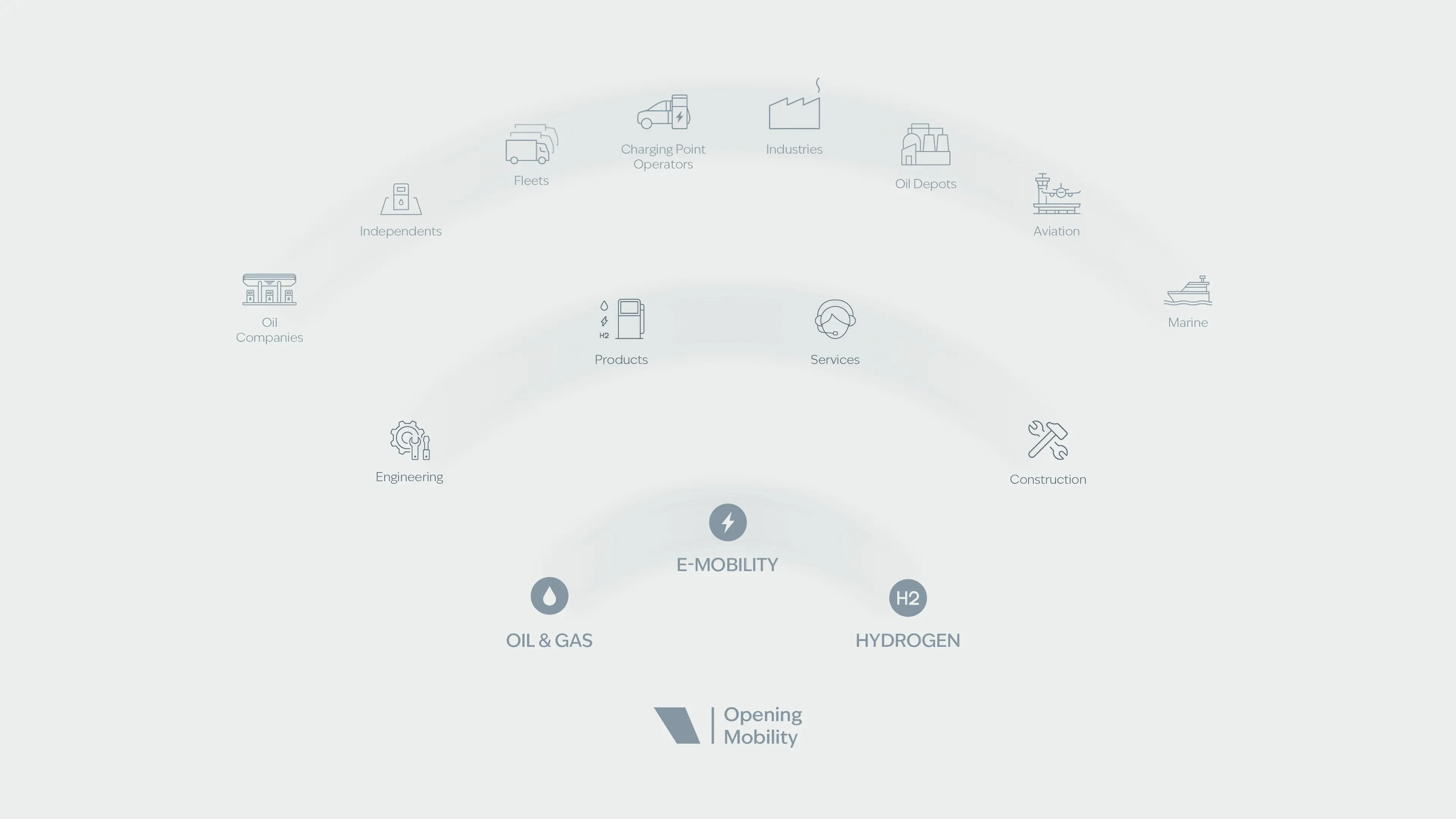
The architecture fix: separate, clarify, colour-code. The single most clarifying decision: split the portfolio into three distinct brand roles with dedicated colour territories:
- Petrotec Group (Grey): institutional, strategic, the parent. Grey as intelligence ("Grey Matter"), European engineering credibility, minimalism, and a neutral canvas that amplifies partner and client brands.
- Petrotec (Green): the manufacturer, product leadership, innovation, technology.
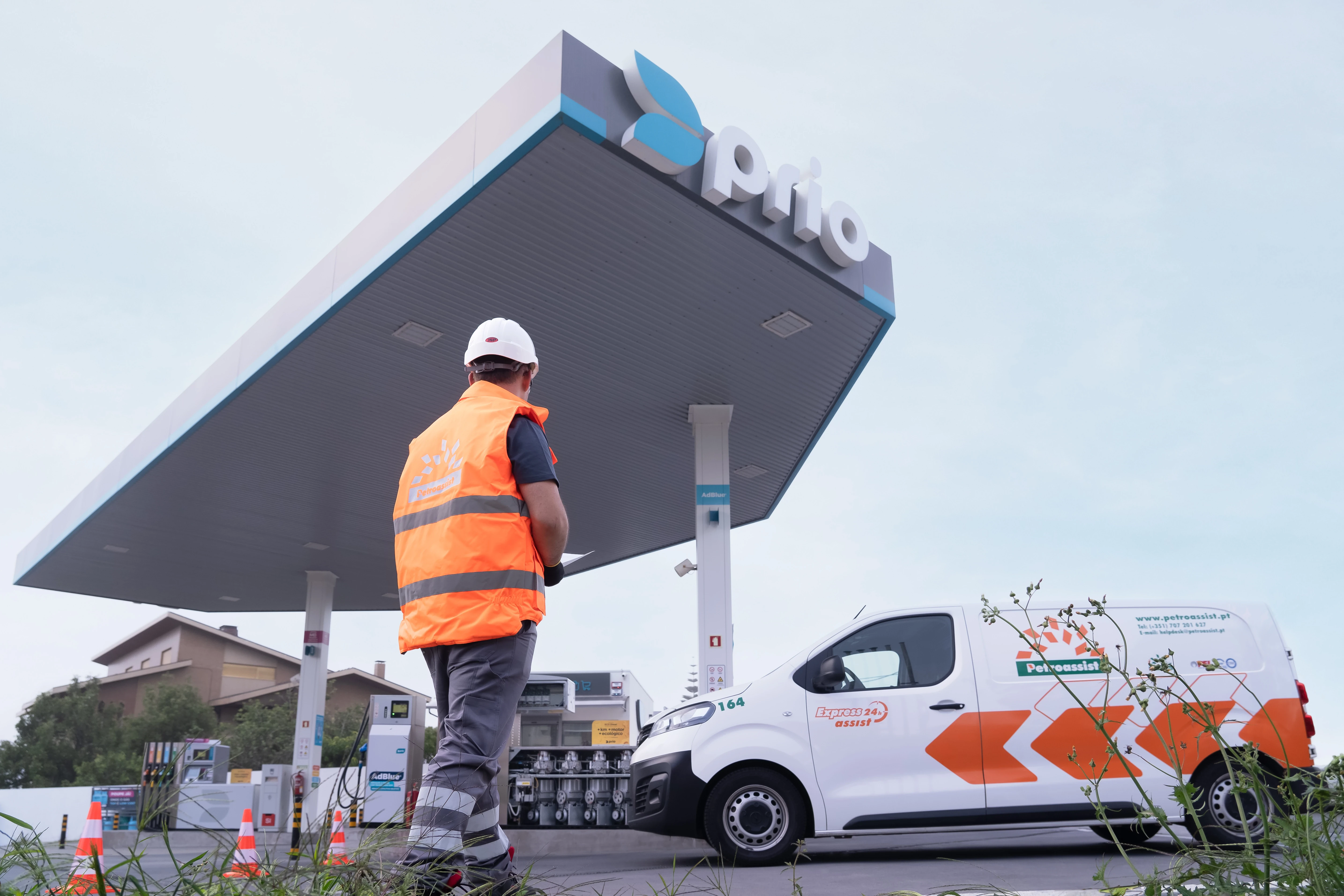
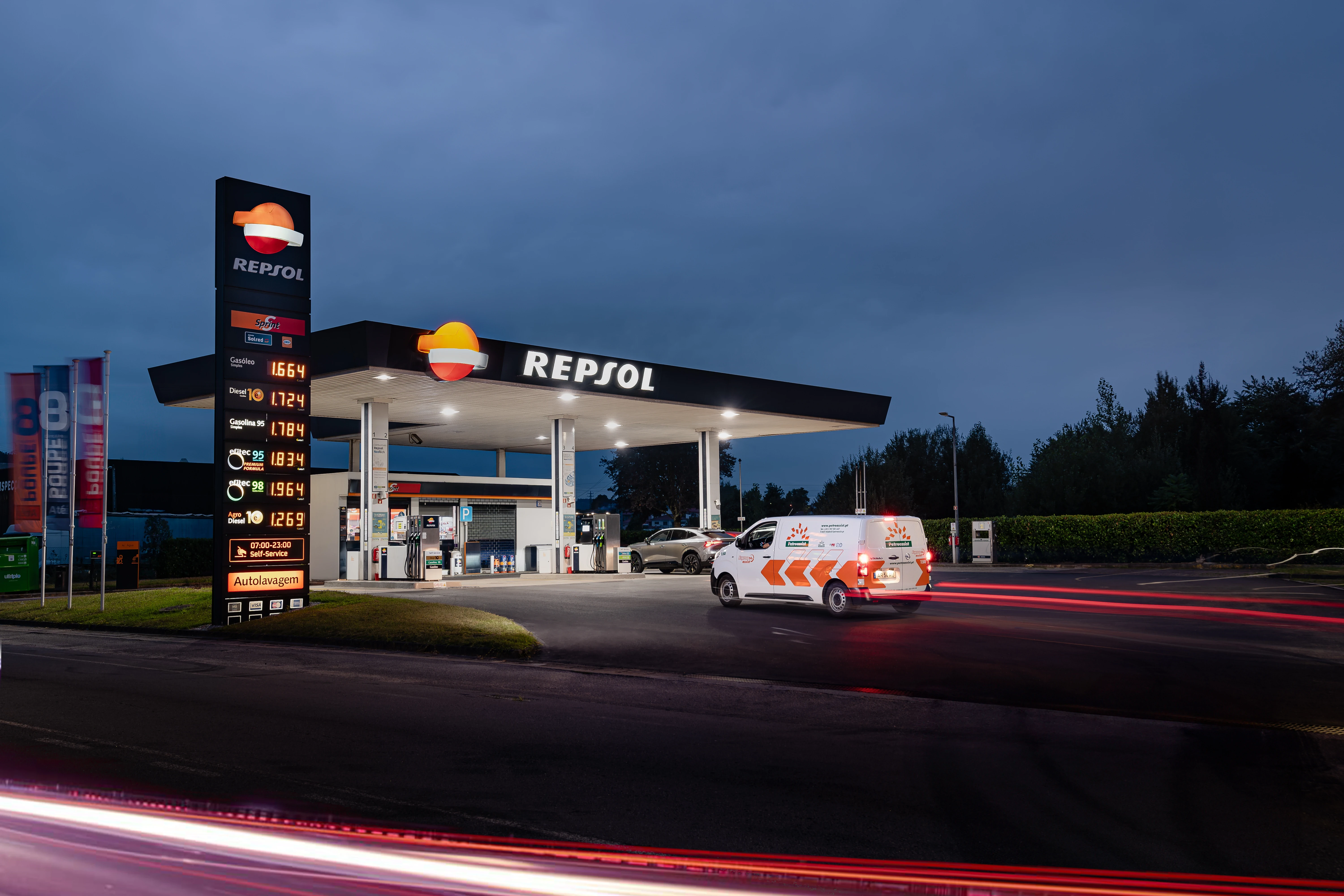
- Petroassist (Orange): services, proximity, responsiveness, human connection.
Each brand now has a clear job, a clear audience, and a clear personality while sharing one strategic backbone.
Why Grey Matters: making a colour into a position. Grey wasn't a default. It was a strategic asset. I built the rationale for grey as: intelligence (Grey Matter/The Thinking Force), European engineering identity (minimalist, reliable, built to last), technical precision, B2B trust and stability, and a deliberate canvas that lets partner brands shine. This transformed what could have been "corporate neutral" into an ownable, differentiated position.
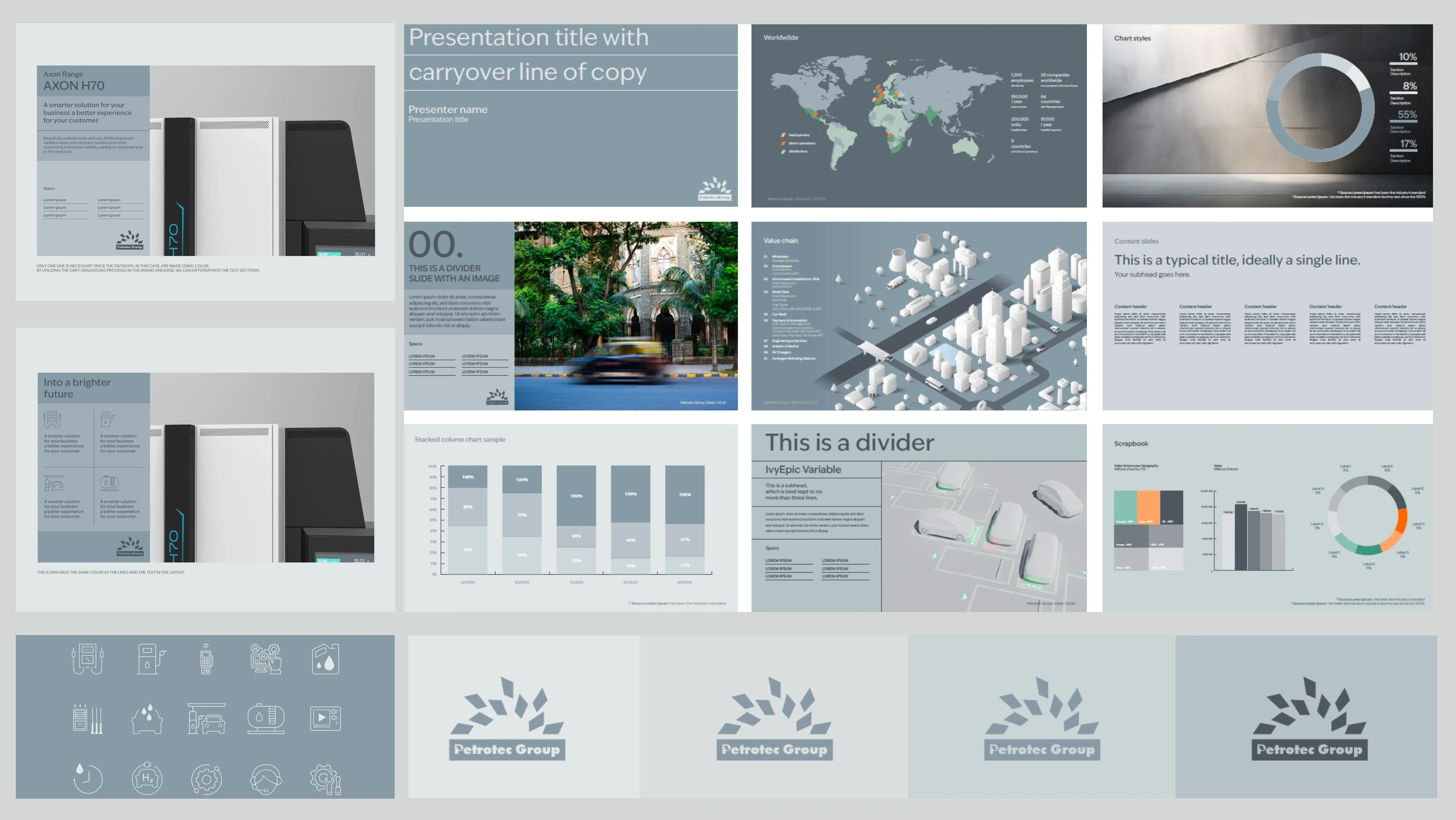
Brand System: Built from Scratch. Created the full strategic backbone: Brand Elements Table, Golden Circle (Why/How/What), Brand Behaviours, Tone of Voice, narrative pillars, motion identity principles, graphic language rules, and a governance model designed to scale globally without bottlenecking execution.
The Petal: A Logo Becomes a System. Instead of relying on a static logomark, I extracted the petal from the negative space of the "P" and re-engineered it as the primary brand icon. It was designed to live independently across digital products, UI, social media, motion graphics, and dynamic brand expressions. The petal became the modular building block of the visual system: it scales, rotates, patterns, and animates while remaining instantly recognisable. A logo that works like a design system, not a stamp.
Equal Design: Precision as Visual Language. Developed a visual framework built on structure and alignment: technical drawings, vertical and horizontal lines, precision grids. A design language that communicates engineering quality, system thinking, and European craftsmanship without ever showing a blueprint. The identity feels engineered because it is.
Motion Identity. Built a motion-first approach ("Our mission in motion") using clean 3D and animation language that stays neutral and adaptable across corporate and commercial brands. In a static industry, a brand that moves signals leadership.
Website UX & Design System. Designed the wireframes and UX structure for the group and brand websites. Contributed to the design system and colour system, ensuring the digital experience translated the strategic architecture into navigable, coherent user journeys.
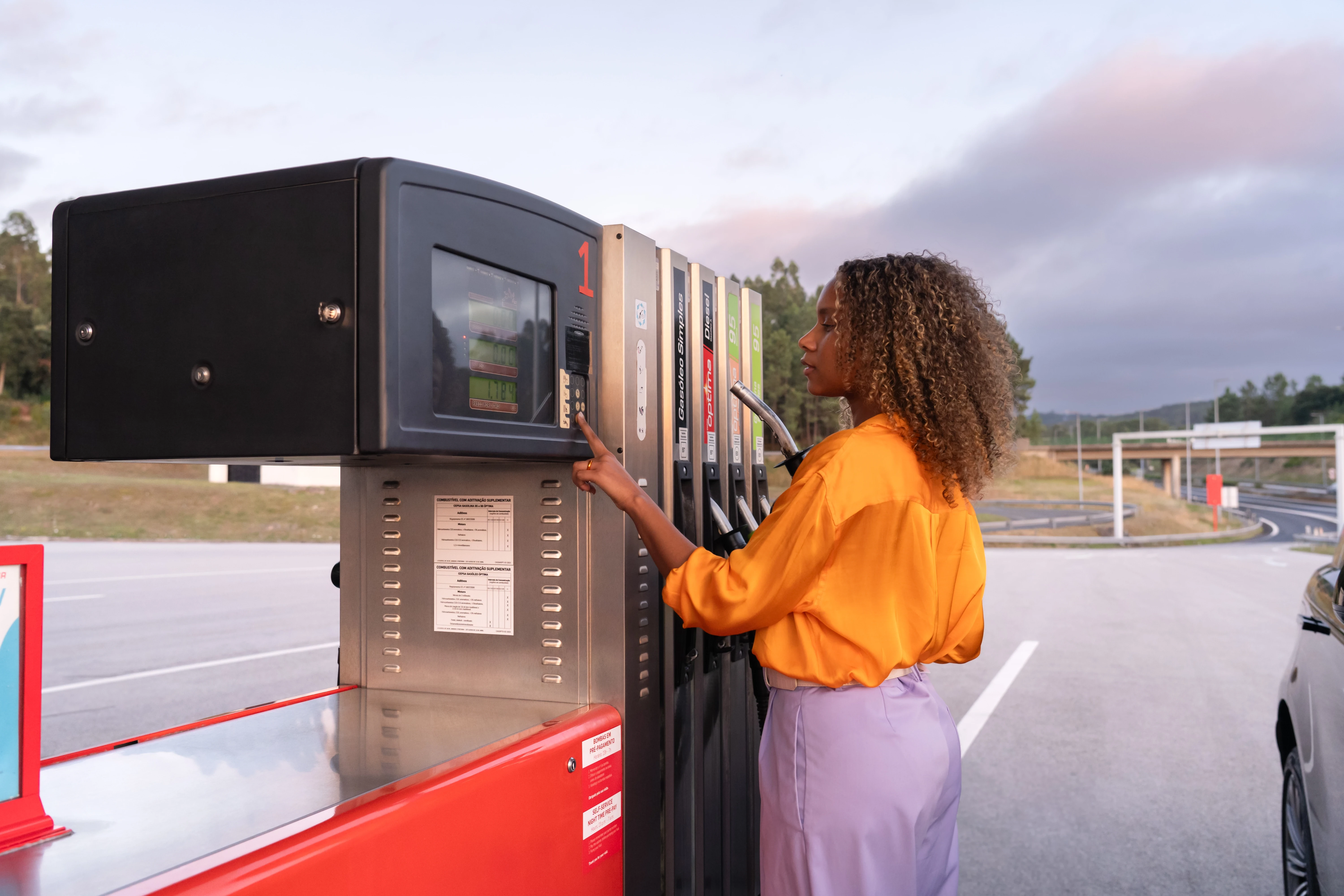
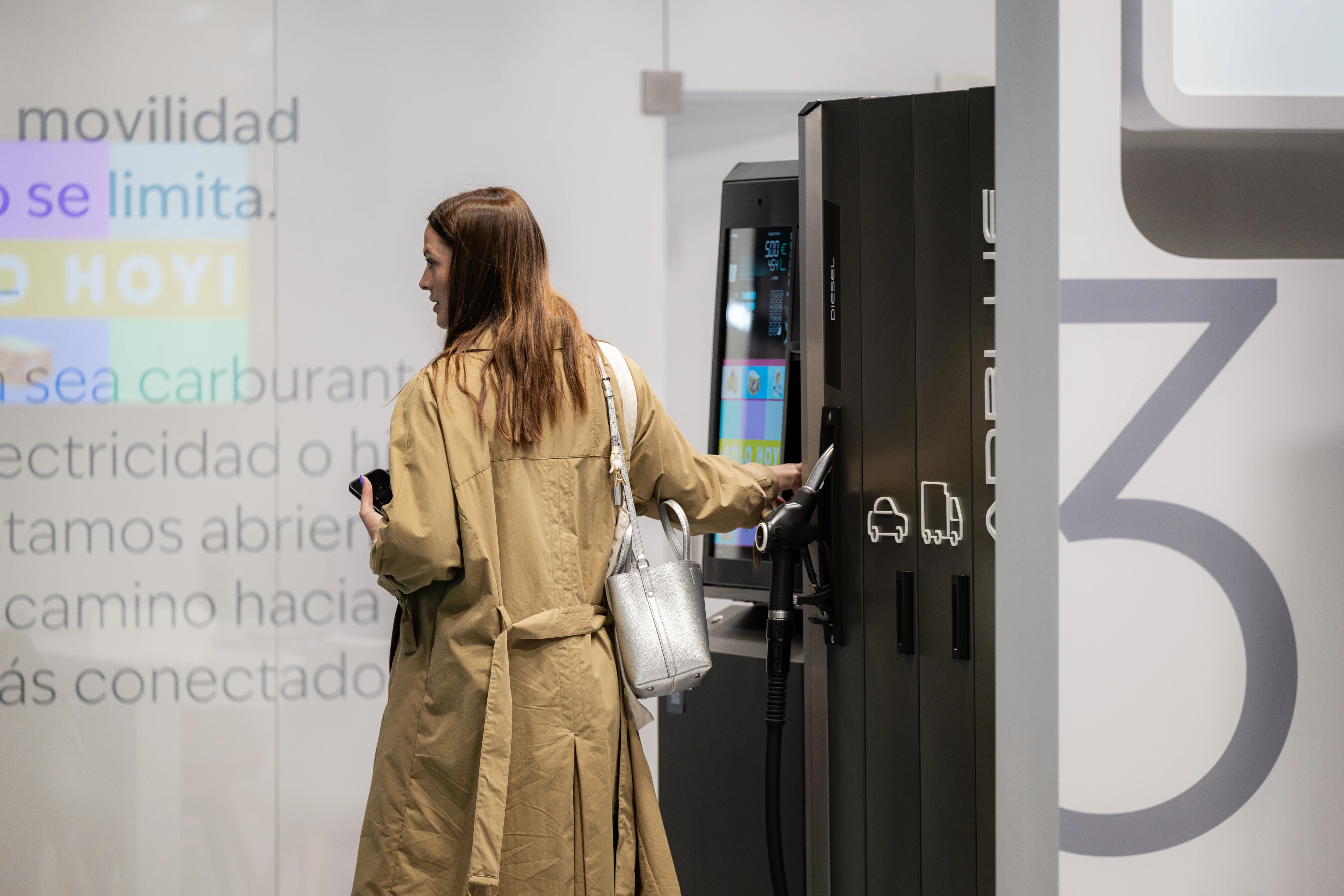
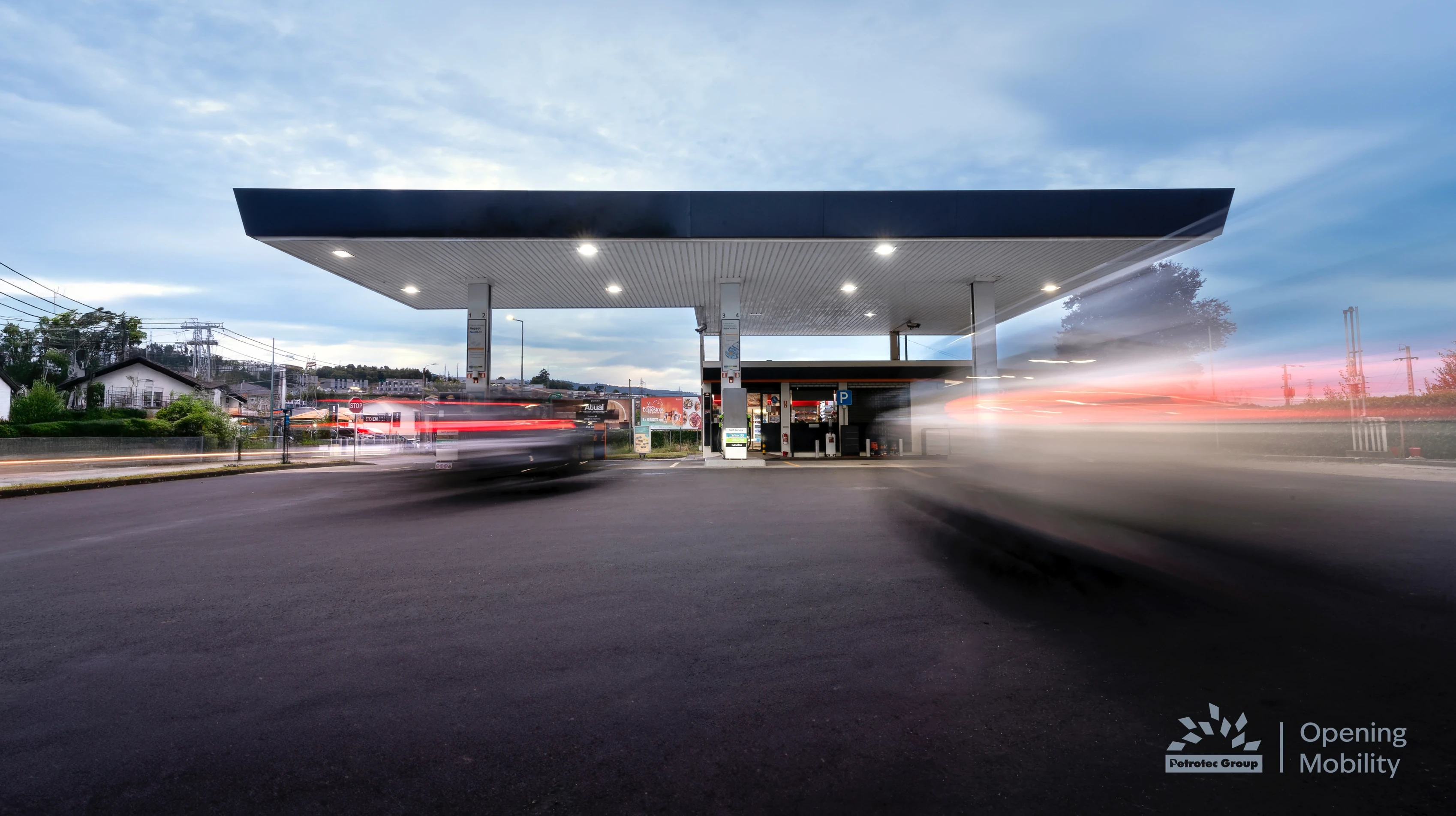
Photography Direction. Planned and directed product photo shoots with models and real hardware, defining the visual codes: composition, lighting, materials, and human presence. The goal was to replace generic B2B stock with a credible, modern aesthetic that matches the engineering: clean, precise, confident, and built for digital. Real work. Real people. No fakes.
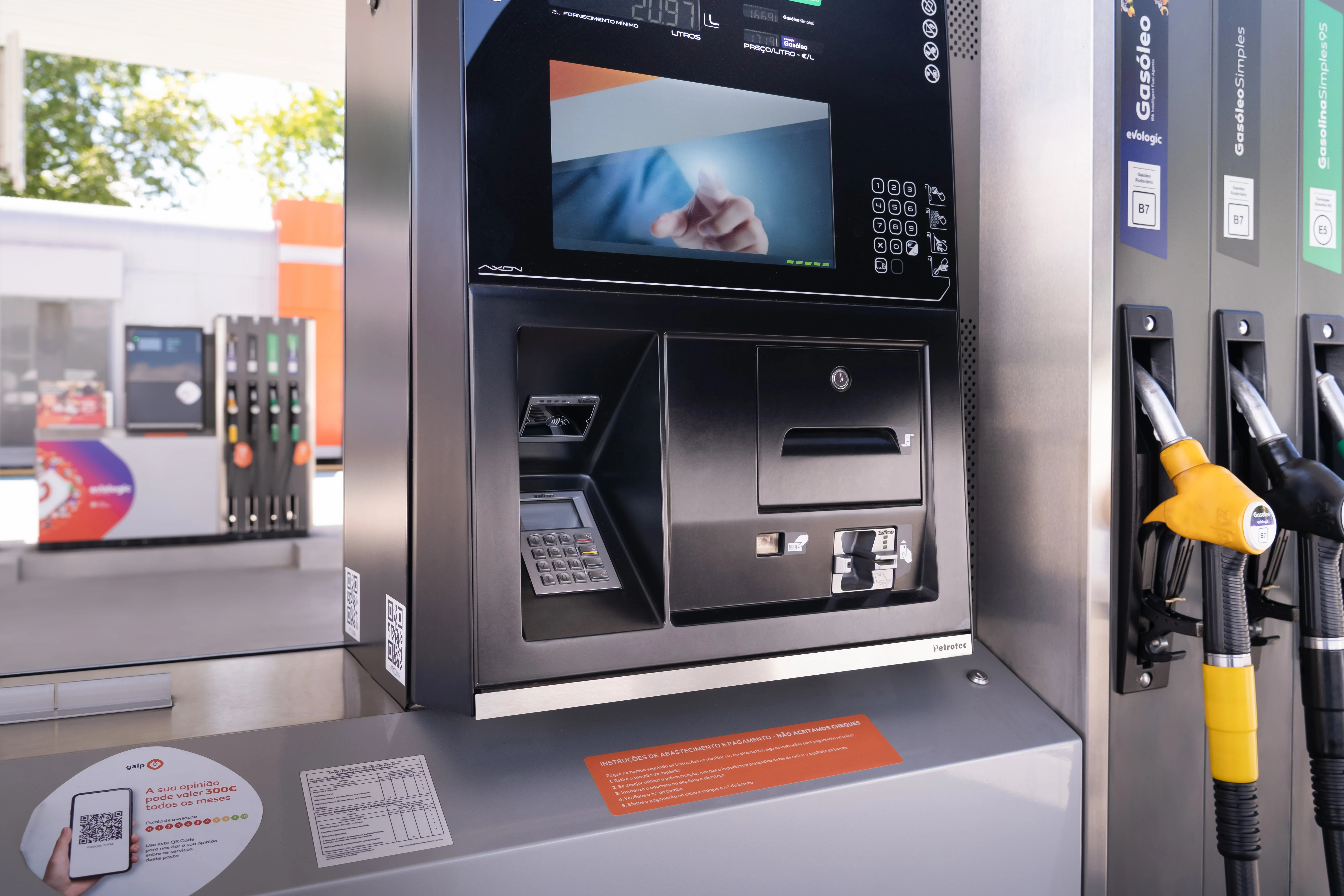
Product Look & Feel. Owned the visual identity, look and feel, and brand consistency across all product lines. Translated technical product capabilities into clear, market-relevant assets: UI/UX representations, iconography, product graphics, brochures, whitepapers, presentations, infographics, animations, and videos, maintaining engineering accuracy while sharpening commercial relevance.
Trade Show Stand Concepts. Developed the creative concept and experience design for Petrotec's presence at major industry events: London EV Show, World Hydrogen Summit, Motortec, UNITI. Each stand translated the Opening Mobility platform into spatial design: messaging hierarchy, visual language, motion/LED integration, product staging, and visitor flow. Built to signal category leadership, not just attendance.
The Petrotec Way: An Internal Operating System. Defined and implemented The Petrotec Way, an internal culture and brand operating system that drives alignment across teams. Not a manifesto on a wall. A practical framework shaping how people think about brand, innovation, and collaboration day to day.
Social Media Governance. Deployed a unified social media governance model aligning leadership, product, HR, sales, and agency partners under one voice, one strategy, and one set of rules, ending the era of improvised, uncoordinated brand presence.
Petrotec Group went from market challenger to category-defining brand, with a clear purpose, a resolved architecture, and a design system built to scale across markets, products, and energy verticals.
Opening Mobility became the organising principle for everything: product launches, trade show experiences, recruitment, internal culture, digital presence, and industry positioning. The brand now communicates with one voice across three distinct entities, each with its own personality and audience, but all connected to the same strategic backbone.
The transformation moved Petrotec from a company with top-tier engineering and no visibility to a brand that leads the conversation at the World Hydrogen Summit, the London EV Show, Motortec, and UNITI. It now has a presence, a voice, and a design language that signals what the products always deserved: leadership.